While the focus of investigations in Hidden Hydrology are often around the lost, buried and disappeared, the true nature of the hidden comes up in some interesting ways.  A recent article via the CBC discusses a new find “‘This is a major discovery’: Explorers find massive ice-age cavern beneath Montreal” and discusses a hidden “Cathedral-like chamber, formed more than 15,000 years ago, [which also] features underground lake”.

The spot was found by cavers who busted through a wall in the popular the Saint-Leonard Cavern,  The cavers, “Le Blanc and Caron said they were able to pinpoint the location of the passageway using a dowsing rod, similar to the wooden divination tools sometimes used to find groundwater.  The two men, who first got into caving as a hobby, said they’ve been searching for an unknown branch of the Saint-Léonard cavern for years.”

A video of the exploration:

While groundwater and aquifers are well known to exist in cities, the relationship of surface and subsurface geology and hydrology makes for some interesting interactions with hidden hydrological regimes – in this case subterranean interface with the aquifer. Perhaps few examples as extreme as this in modern cities, but interesting to see something hidden for years emerging after so long.

Source of the header image:  Massive Underground Cavern Formed During Ice Age Discovered By Amateur Explorers (IBT)

River Piracy sounds like an exotic form of stream based pillage and plunder, but rather refers to the reorientation of stream flow from one channel to another.  Also known as stream capture, the causes vary, and include tectonics shifts which changes slope, natural dams (landslide or ice), headward and lateral erosion, karst topography, and glacial retreat.   Notable ice dams have diverted rivers, of note is the River Thames, which was shifted 450,000 years ago cause it to

A recent set of stories about the Slims River in the Yukon territory illustrates the last of these points, where the retreat of the Kaskawulsh glacier and it’s shift from the Slims River to the northwest and into the adjacent Kaskawulsh River to the southeast.  The phenomenon isn’t uncommon, but the pace in which this ‘theft’ occurred is notable: “Such a transformation has occurred numerous times throughout the planet’s geological history – often due to gradual erosion or the movement of a fault – but has never been observed to occur as suddenly, happening over just a few days in May 2016. ‘Geologists have seen [evidence of] river piracy before, but nobody to our knowledge has documented it actually happening [within] our lifetimes,’ explains Shugar, Assistant Professor of Geoscience at the University of Washington, Tacoma.” The image below shows the “aerial view of the ice canyon that now carries meltwater from the Kaskawulsh Glacier, seen here on the right, away from the Slims River and toward the Kaskawulsh River.”  

A map of the area shows the relationship of the river and the shift, which short-circuited a longer path through the Kluane River into the Yukon River and eventually the Bering Sea, now connecting to the Alksek River and flowing into the Pacific Ocean.  From a global perspective the flow doesn’t mean much, but on a local scale the impact is more acute.

From the article in the Globe and Mail, “Climate change stole a Yukon river almost overnight, scientists say. Here’s how“, which mentions the process at work:

“That water now flows into the Kaskawulsh River, a tributary of the Alsek, which runs southward to the Pacific. Following this route, it reaches the ocean some 1,330 kilometres away from where it would otherwise have ended up. Signs of the rerouting have been observed on both sides of the mountainous divide. Gauges on the Alsek River reveal that it experienced a record discharge last year. Because the river mostly flows through parks and protected lands, the increase has had no immediate human impact. On the Slims side, the effect of water loss is more obvious. Last summer, Kluane Lake dropped a full metre below its lowest recorded level for that time of year. The reduced inflow from the Slims spells a huge change for the 65-kilometre-long lake, with implications for nearby communities and visitors who access its waters for fishing and other activities.”

The quality of the Lake ecosystem is one issue also, as mentioned in the Guardian article “The river stolen by climate change”, quoting scientist Jim Best:  “The dramatic switch was caused by the rapid retreat of the Kaskawulsh glacier – thanks to climate change – which caused the flow of the meltwater to be redirected, and prompts questions about the impact it could have on the surrounding Yukon territory. Best points out that while much of the southern part of the territory is ‘sparsely populated’, and therefore potential flooding caused by the extra water is unlikely to cause any ‘real human impacts’, the opposite issue could be a cause for concern further north.  ‘If Kluane Lake levels go down,’ he predicts, ‘the lake could thus have no inflow and no exit flow, which would radically alter lake water nutrients and circulation, and this may impact on the lacustrine ecology. In addition, if the lake outlet were to dry up as a consequence, this river would be dry or far lower and thus the few habitations along it would be affected.’”

The dry valley left over, in this case the Slims River, is referred to as a wind gap, and scientists have discussed the potential issues erosion and dust storms.  As noted in the CBC story, “Retreating Yukon glacier makes river disappear“, the river is: “…prone to dust storms.  “It’s certainly not unusual to see rapid drainage changes in and around these glaciers. It’s a common situation,” Bond said.  “Until vegetation really starts to stabilize that floodplain, it’s going to be a dusty place, I’d imagine … It will be a really interesting study to see how that floodplain evolves in the next ten years or so.”


Week three of the Waterlines class featured Seattle writer and geologist David B. Williams.  Perhaps best known as the author of the recent ‘Too High and Too Steep’, a chronicle the large-scale manipulations (topographic and hydrologic, to name a few), Williams shared a more focused talk on his upcoming book Waterway: The Story of Seattle’s Locks and Ship Canal, which coincides with the Centennial of the Hiram M. Chittenden Locks this year.  Following the course theme, and touching on some previous topics, the story encompasses the trials and tribulations to get the locks built, and the large-scale impacts that such endeavors have on the ecological and hydrological systems of Seattle.

David is an engaging storyteller, so he laid out the evolution of this significant part of Seattle’s history, touching on the geology (with the north south orientation how important the waterways were to getting around, especially, east-west movement), and the use for years by native people, who used the portage between Lake Washington to Lake Union, and then a quick connection to gain access to the ocean, and vice-versa, for the past 10,000 to 12,000 years, with stories of Kitsap Suquamish coming to Lake Washington because it was one of the largest freshwater lakes in the region.  The idea of a ship canal of some sort is as old as Seattle itself, first pitched by Thomas Mercer in 1854 and finally coming to fruition as a way to move coal, timber, and people, after many attempts 63 years later.  In fact there were multiple routes proposed and attempted with big Seattle names like the aforementioned Mercer, along with Burke, Denny, and Gilman, cutting through Smith Cove, routes across what is currently downtown, and one of the most absurd in Seattle’s history – the Semple Canal.  This map shows a number of these routes, and also the one natural, yet not very viable connection vai the Black River, which was mentioned in the previous post on Seattle archaeology as outlet from Lake Washington and would eventually fall victim to the draining of Lake Washington.

By Dennis Bratland – Own work, CC BY-SA 4.0,

As mentioned, Semple’s Canal was perhaps the craziest scheme, wanting to slice through one of Seattle’s seven hills, Beacon Hill, which stands almost 350 feet tall.  Williams documents it on his blog in this post, with a couple of graphics showing the route and section cut (noting a maximum cut of a mere 284′-6″), highlighting the absurd notion of cutting a canal through a hill, although a good portion of the material removed from the canal before it was shut down was used to fill the Duwamish estuary into what is now industrial lands, and frankly, based on some of the other history, it would not have surprised me if this would have happened.

The eventual route of the Canal was landed on eventually towards the end of the 19th century, connecting to the Puget Sound through the existing Shilshole Bay and the eventual location of the locks, connecting through Salmon Bay, which was a fluctuating saltwater tide zone, connecting through the Fremont Cut to Lake Union, and the Montlake Cut connecting Portage Bay on the west with Union Bay and larger Lake Washington on the east.

The conditions prior to implementation show Salmon Bay connected to salt water, and involved slicing through Ross Creek and wetland zones between Salmon Bay and Lake Union, where a creek was feeding the Bay.  To the east the portage had become a narrow log flume at the narrowest point connecting Union Bay and Portage bay, completing the connection from lake to sea.

As mentioned, the eastern Montlake Cut was used as a log flume with a narrow channel (developed by Denny and others) connecting through Portage Bay, and a similar effort was made to connect through Ross Creek via what is now the the Fremont Cut.  A photo showing the area looking from Union Bay towards the west from Paul Dorpat’s blog showing the isthmus with Portage Bay in the distance prior to ship canal.  This area was sliced through with a log flume (seen on the 1894 map above) in the 1880s and at times through the early 1900s to move timber from inner areas to Seattle and beyond, setting the stage for the eventual connection.

A second image showing the narrow connection of the log sluice from 1886 that is seen on the 1894 map, one of the thin connections which eventually were expanded for free flow of goods and people across Seattle.  A dam at the upper end held Lake Washington above the level of Lake Union, and logs were dropped into this chute to float on the next leg of the journey.

While the connections seem logical, the elevations of each water body were different, with the level of Lake Union around +20, the level of Lake Washington at +29, and Salmon Bay elevation lower as it entered the Puget Sound, often not having standing water at times.  The process of building the locks set all of these elevations at the same as Lake Union, which raised Salmon Bay and made it a continuous fresh water bay, which is why it works as a place to over-winter fishing fleets as it is today (see Deadliest Catch) to keep boats out of salt water.  It also lowered Lake Washington, which as mentioned disconnected the lake from it’s natural outfall at the Black River to the south, replumbing the south area of Seattle while creating a whole lot of new lakefront land.  The completion of construction of the locks and the eventually breaching of the Montlake coffer dam (below) and the other coffer dams at the Fremont Cut, (after having to shore them up a few times), filled Salmon Bay with fresh water, and caused Lake Washington to drain down the 9 feet slowly over a few months

The locks, which opened to fanfare and massive 4th of July celebration in 1917, are fun to visit today to watch ships come in, go to the fish ladder, and see the activities.  According to Williams, these are the only government locks in the US that are crossable to the public (didn’t know that) and the main traffic, although peppered with an occasional working vessel to Portage bay, consists mostly of pleasure craft.  Also, while they did originally build a fish ladder, it didn’t work well (and was improved years later, which make a fun viewing opportunity).  Williams mentioned that fish tended to just get into the locks and ride up to travel upstream.  It’s an interesting resilience story that fish that were cut off from the Cedar River where they spawned when the Black River was disconnected, and instead of heading up the Duwamish/Black/Cedar to the south, would still be able to figure out how to get upstream via alternative routes via Shilshole miles north from their original spawning route. Talk about a well established navigation system.

The impacts for Seattle, much like the other massive changes, ended up having huge economic implications in positive ways, with the ability to tap into industrial lands for coal, timber, and shipbuilding, and some minor military use, along with what are mostly now marinas for pleasure craft today.  The fact that maritime industries are only second to aerospace in the Seattle economy is surprising, which owes much to the ship canal.  Seems a common story for Seattle, make massive change and reap the benefits (to some), even if it cuts off a river that happens to be the home place for local Native people.  To comprehend the 60+ year journey from idea to fruition, and the hundred years of operation since, another story of changing land and waters influencing our urban lives every day. Excited to see some of the events and read David’s upcoming book for more.  On that note…

Addenda: Making the Cut

A great resource on the upcoming centennial festivities is the website Making the Cut: The Locks, The Lakes and a Century of Change, which provides info on events, much of the history mentioned above, and a good section on historic maps which shows a good cross section of hidden hydrology in relationship to the hydrological manipulations to connect the lakes to the ocean.  A series of before and after maps documents the changes in the locks, Lake Union and Lake Washington, and other areas.  The series below highlights the evolution from the tidal marsh of Salmon Bay prior to the locks being installed in 1916 to the freshwater waterway today.

Salmon Bay – Today
Salmon Bay – prior to 1916 | Blue = Water |  Green = freshwater wetlands | Pink: saltwater wetlands | Brown: intertidal areas (or tidal flats)


Save

A great kickoff lecture to the Waterlines class at the Burke Museum featured noted regional geologist and retired UW Professor Dr. Stan Chernicoff and his exploration of The Origins of Seattle’s Landscape.  Having read a bit about the local geology over the years, and having experienced some specifics (particularly the glacial till in Seattle) in my work, I had a rudimentary understanding of the general picture in our region.  Thanks to this lecture, and the philosophy that ‘dynamism is key and change is inevitable’ espoused by Chernicoff, I know a lot more and think about the region in new ways.  From his lecture, I found some interesting links between the larger and longer scales of geologic time and it’s relevance to the Hidden Hydrology project.

His lecture loosely focused around the concept of changing Waterlines around the region, and organized his talk to be roughly chronological and covered a lot of ground – from 1.1 billion years into the past to 250 million years into the future.  Much of the beginning conversation was looking back at the time when Seattle was not coastal but inland as part of the Rodinian Supercontinent (one of the pre-Pangean configurations) and the coastal accretion of lands from the final supercontinent (where to coast was originally at the MT/ID border), and the lands that were added over the past 150 million years (Okanogan Mountains, Cascade Mountains, San Juan Mountains and most recently the Olympia Mountains) through lands being drawn in through subduction.  This means that Washington and Oregon are mere infants in the larger timescale, as Chernicoff mentions, compared with the larger geological history.  The key diagram he showed here is the overlapping sections of the subduction zone in the Juan de Fuca plate and the location of between the Olympics and the Cascade Mountains, with the layers levels and timelines of geological traces over the past 50 million years..

The bit of trivia that Seattle is sitting atop the Olympic Mountains – as you can see by drawing a line through to the Crescent Basalts below us.  The evolution from the last 40 million years in shaping the zone, through Volcanic mudflows (yeah, there was a volcano called Mt. Seattle somewhere near Issaquah) that left lahars 40 million years ago.  This was followed by periods of inundation, and when the land was warm and swampy, which left the deposits of coal near Renton (an interesting Puget Sounds coal history where we ended up shipping to San Francisco).  The marine heritage is also found in the prevalent Blakeley formation, which evolved from a shallow marine estuary from submarine landscape deposits 30 million years ago – and today one can still find fossil shells around many places in the Puget Sound.

There are some interesting facts that illuminate this history and dynamic story of change.  First, while the larger geology set the stage and influences the form, the current lakes, and rivers were a product of the latest glacial period, which Cordilleran Ice Sheet covered the area and the Puget Lobe formed the shape of the current region.  The glacier was around 3000 feet thick, which pushed the sound down almost 1000 feet, and created the depression that allowed water to flow in and formed the modern position of waters.

Puget Lobe Extents – Graphic source from Kruckenberg, 1991 – source

The rule of thumb is the thickness of depression will be 1/3 the thickness of the glacier.  An interesting section (see right) showing how this cap of ice carved out Puget Sound nestled between the Olympic and Cascade Ranges –  with linear scoured channels forming Hood Canal, Puget Sound, Lake Washington, Lake Sammamish, and created the terrains which Seattle occupied.  These were all relatively north-south oriented which coincides with the intrusion and recession of the Puget Lobe.  It is amazing to think of the larger glaciers in the Midwest, such as Minnesota, which were 3 miles thick and the impacts on that landscape, which for my knowledge, creates the rarity of the north-flowing Red River through where I went to college in Fargo, but also created the over 10,000 lakes that dot the region.

Second, is that because of the glaciation and recession, most of the hills in Seattle are glacial drumlins, (with the exception of West Seattle and Magnolia which are drift uplands).  These hills were deposited upon glacial retreat, which gives them a distinctive steep north side and smoother south side, with alignment north-south as well as the long side corresponds to the direction of ice flow.

You see this in the larger hills in Seattle, as well as the creation of the individual creeks that are woven throughout the north section of the city. The topography carved these smaller drumlin shapes with drainages forming in the spaces at edges adjacent to lakes or between two hills. This formed unique geologic features like like Seward Park in the south section of Lake Washington.

A shapshot of the 1894 USGS Topo map shows the formation on Queen Anne (left) and Capitol Hill (right) with the steeper north edges, along with what is still showing the remnants of Denny Hill south before it and other topographic features were removed from the downtown area.

Third, the two smaller lakes in North Seattle, Bitter Lake and Haller Lake, are true kettle lakes, formed with glacial retreat.  A hybrid of this is Green Lake, which also formed in the glacial retreat along with Lake Union and Lake Washington. Fourth, the glacial movement left a trail of glacial erratics all over the area, and I learned about one of the largest, the Wedgwood Rock, which originally was from miles north and now sits in NE Seattle.  Definitely worth a field trip in the near future.

Fifth, the glacial deposition led to a preponderance of landslides, both with steep slopes, along with the layers of permeable Esperance Sand sitting atop a layer of Lawton Clay, which causes water to flow under the sand and create a slip zone (shown on right side of diagram below).

This is exacerbated by the copious winter rainfalls, which exacerbates the issue via critical liquifaction zones, which  means “…a phenomenon whereby a saturated or partially saturated soil substantially loses strength and stiffness in response to an applied stress, usually earthquake shaking or other sudden change in stress condition, causing it to behave like a liquid.”  Thus the landslides and earthquakes have shaped the hydrology over time, as valley configurations shift with deposition from streams but also are influenced by these disturbance regimes.

The Magnolia Neighborhood is one of those areas where it has overlapped with the danger of building on steep/unstable slopes, as shown here in a wikipedia image of a slide in 1954 on Perkins Lane, a relatively frequent occurrence in Seattle in particular areas over the years.  Chernicoff’s hint:  Don’t by a house there.

The final part of Chernicoff’s talk focused on the ‘Rise and Fall of Seattle’, with a theme that in our dynamic and ever-changing landscape, “we can’t get accustomed to where water is”.   He mentions four factors that will influence the geology of Seattle, including Local Geology, Regional Tectonic Factors, Regional Isostatic Factors (i.e. glacial rebound), and Global Eustatic factors (i.e. sea level rise).  This was interesting, as the local conditions were all creating conditions that led to raising lands and lower levels of water.  For instance, the two local geological factors were river sedimentation and landslides, both of which add land particularly at the deltas of larger rivers, such as the Skagit and Nisqually Rivers.  As Chernicoff put it, through those two factors, the entire Puget Sound is trying to fill itself in.  The regional factors of tectonic activity are at work, with quakes occurring regularly, which can instantly change the shape of our landscape through an earthquake.  A slower mechanism continues to shift land with raising land due to glacial rebound, bouncing slowly back from being compressed by glaciers thousands of years back.

Inevitably, for all the minor modifications of local and regional factors, the larger impact is, wait for it… yep, global change, in particular the shifts associated with climate change.  The melting of remnant ice sheets in Greenland and Antarctica, warming causing the thermal expansion of water combined to create higher levels, and lead to massive impacts on the waterlines of Seattle and everywhere else.  He showed as an example a slide of the map Islands of Seattle, a great project by Jeffrey Lin (inspired by the original Burrito Justice San Francisco Archipelago map.) which hypothesized on melting of all global ice, including the Antarctic, which would result in a 240′ rise in sea level, creating a very dramatic new waterline and hydrology for the City.

For Chernicoff, it wasn’t a question of whether this would this happen or not.  His geologists time lens is long and he knows there will be large-scale global shifts.  The question is yes, however, does the time scale of this inundation take 30 years, 500 years, 10000?  It’s an interesting juxtaposition of of deep, long geological time coupled with the dangerous (but possibly earth saving) agency of humans in creating changes in rapidly shorter and shorter time scales, via anthropocentric factors.  While we rightly fret over our fate and try to come up with solutions, the idea of dynamism and constant change is a good perspective. In the end, geological time and processes will, it seems, always win, if we’re around in another 250 million years we can experience a new shift to a larger subcontinent, as the Pacific is getting smaller and the Atlantic is getting bigger, so our coastal woes will change when we’re in the middle again.  Full circle.

This has some implications, obviously for connecting history to present and future, as we are constantly chasing moving targets when we deal with landscape and water.  How will these changes impact our understanding of historical conditions with current ones?  At the short time scale we are considering, does it matter?  Will rapid global and local changes impact our opportunities and ideas in which to engage with planning and design interventions?  Something I’ve not ruminated on long enough to have ideas, but more to come.  And more on Waterlines next week.

ADDENDA

As a follow up, a remembered this link from the Burke on Seattle’s Ghost Shorelines links there’s an interesting Waterlines video showing this evolution of the most recent 20,000 years of the sound – since the ice age.

Save

Excited to see this announcement of a series classes focused around the Waterlines Project (see my post about it here as well).  The four week  ‘Waterlines Class Series‘ meets Wednesdays at the Burke Museum and costs $120 ($100 for Burke members), and aims to cover lots of territory on Seattle’s interesting landscape history.  From the site:

Wednesday, April 19, 2017
The Origins of Seattle’s Landscape
Dr. Stan Chernicoff
Discover the dynamic geological forces that shaped and continue to shape the lands of the Salish Sea. During his 30-year tenure at the University of Washington, geologist Dr. Stan Chernicoff established a unique rapport with his students and a mastery of subject matter. In 2000, he received the University of Washington Distinguished Teacher Award for lively curiosity, commitment to research and passion for teaching.

Wednesday, April 26, 2017
Before the Cut
Dennis Lewarch, Suquamish Tribal Historic Preservation Officer
Using archaeological, ethnographic and historical data, Dennis Lewarch disccuses the effects of shoreline transformations on indigenous populations. A professional archaeologist, Lewarch has worked in western Washington for over 30 years and brings useful insights that intertwine environmental change, archaeological data and tribal land use in the region.

Wednesday, May 3, 2017
Waterway: The Story of Seattle’s Locks and Ship Canal
David B. Williams
Find out what drove Seattle’s civic leaders to pursue the dream of a Lake Washington Ship Canal for more than 60 years and what role that canal has played in the region’s development over the past century. The author of Too High and Too Steep: Reshaping Seattle’s TopographyThe Seattle Street-Smart Naturalist and Seattle Walks: Discovering History and Nature in the City, David B. Williams also organizes the Burke’s annual Environmental Writer’s Workshop. His upcoming book, Waterway, will be out June 2017.

Wednesday, May 10, 2017
Reclaiming the Duwamish
Eric Wagner and Tom Reese
Eric Wagner and Tom Reese, author and photographer of Once and Future River: Reclaiming the Duwamish, discuss the history of Seattle’s relationship with its one and only river. Wagner’s writing has appeared in Scientific American, Smithsonian, Audubon and other publications. Reese is a Pulitzer Prize-nominated photojournalist recognized for his feature work and explanatory reporting during his career at The Seattle Times.

A gem of a publication semi-related to hidden hydrology by very related to cool maps, is one the US Geological Survey Miscellaneous Investigations Series I-1799, published in 1988, entitled the “Atlas of Oblique Maps: A collection of landform portrayals of selected areas of the world“.  As noted, the maps are all oblique aerials, and range from 1961 to 1986, so are pre-digital.  The ability to represent complex geographic and topography features enlightens many maps of this sort, and the techniques to create this makes for a fascinating read.

Some introductory text from the Preface:

There’s a brief by interesting background for the document and some of the key map-makers, including A.K Lobeck, E.J. Raisz, and P.B. King.  Some of the benefits of this type of map are discussed, including more realism and easier comprehension, and ability maintain scale.  Disadvantages included displacement of features, and hiding of key elements, and a relative inexactness of elevation and location.  I think of many of the maps of cities in the late 1800s that were drawn using similar techniques, which show features in a compelling way, but somehow exist with a tantalizing lack of precision.

The graphic standards used are explained, which allows for some uniformity. (click to enlarge):

The mechanism of the Isometrograph was fascinating, which provides the opportunity to “develop a parallel-perspective framework from a vertically viewed contour map” allowing for three-dimensionality without reproducing hidden lines, something we can easily do today with a number of digital tools, but at the time was pretty incredible.

That said, there’s a ton of interpretation and creativity involved, to take the three-dimensional framework and convert it into a compelling illustration, as noted in the sequence below.

So why should these matter, aside from their value as historical maps. The conclusion sums it up, along with a very prescient commentary on the value and future of mapping in our current age of Google Earth:

“Because oblique maps are instructive and easy to read, they help the scientist communicate with the layman concerning our environment, especially in those areas, such as the sea floor, that are not easily accessible.  With increasing population and all its attendant stresses on the planet, the need for this communication will become ever greater.  Fortunately, in the near future, with new techniques and with the use of computers, the cartographer will be able to respond to this demand and create oblique maps more quickly and more economically.”

A bunch of the examples below show the range of maps – which I count over 100 total, with a vast range in geography from Alaska, Washington and Oregon, California, and many from around the world.  The simplicity and elegance of the black and white showcases volcanic variants in the Pacific Northwest, two of my favorite places, Crater Lake and Mount St. Helens.

Some simple color accents coastal variation, in this case Willapa Bay in Oregon.

And the impact works as well for more urbanized zones, in this case San Francisco Bay.

The ability to use the oblique maps to carve out subsurface geology is interesting as well, in this case showing the Sierra Nevada mountains near Mono Lake.

And the bathymetry also, revealing hidden hydrology of bays and coastal waters.

The maps delve into the diagrammatic, as this one stood out to me.  The image hovering above the map shows the location of underway navigation transponders in the Pacific Ocean off the coast of Mexico.  The squiggly lines show the path of a ship that was mapping the bottom using sonar over multiple years.

The final section of the document highlights what are called ‘Cognitive Drawings’, which are somewhat more familiar slices of topography and geology that often appear in text-books, such as the evolution of river valley from sharper V-shapes to more subtle U-shaped valley systems.

Another hybrid map shows the relationship to the geologic features, in this case Ore deposits in Utah, with some simple accents, again revealing the underlying geological story from below.

The technical aspects of making these maps is admittedly less of a barrier today, but much of what comes from the digital realm lacks the tactile, illustrative quality shown here.  A post in Landscape+Urbanism on the art of Matthew Rangel comes to mind as a similar quality in new work, and the inspiration of graphic quality and communicative value is inspiring.  Worth a long perusal.  Enjoy!


Mexico City has been featured a few times recently in the New York Times, with a focus on some of the fascinating hydrological history and its implications to modern urban life.  I was very ignorant of the specific characteristics of the city, and while I love Mexico have only had the chance to spend a long layover in Mexico City proper a few years back.  I learned much in these few articles, with a desire to dig deeper as well.

Climate Impacts

An article by Michael Kimmelman from February 17th, “Mexico City, Parched and Sinking, Faces a Water Crisis” is part of the ongoing ‘Changing Climate, Changing Cities’ series and includes a rich interactive experience, along with a compelling long form read (well worth it).

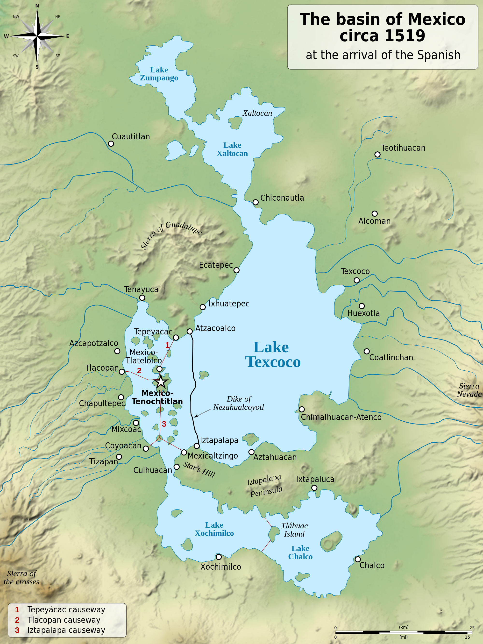
The history of Mexico City as a city has many facets, but two emerge in this context.  First is the concept that the city is built on a lake.  This map shows the configuration of the area around 500 years ago, about the time the Spanish arrived in Mexico.

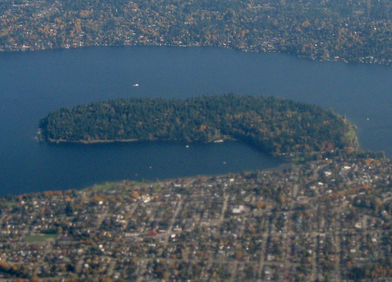
Tenochtitlán, the major urban center, was established in 1325, a larger island surrounded by smaller areas islands amidst Lake Texcoco – shown as the City of Mexico below.  This aided in defense and provided agriculture using the chinampas, islands floated for growing crops.

The city was rapidly transformed via defeat and colonization:

Then the conquering Spaniards waged war against water, determined to subdue it. The Aztec system was foreign to them. They replaced the dikes and canals with streets and squares. They drained the lakes and cleared forestland, suffering flood after flood, including one that drowned the city for five straight years.

The article focuses on both this concept of geological transformation.  The second part of the story of Mexico City is the Grand Canal.  This infrastructural intervention was completed in the late 1800s, and ” a major feat of engineering and a symbol of civic pride: 29 miles long, with the ability to move tens of thousands of gallons of wastewater per second. It promised to solve the flooding and sewage problems that had plagued the city for centuries.”

The City being built on a lake has led to subsistence due to geological forces, and the need for drinking water has meant well drilling on a huge scale – both leading to elevations of the city being dramatically lowers.  This makes gravity-based infrastructure like the Grand Canal a bit problematic, as they can no longer freely drain.  The city, which occupied a metropolitan area of 30 square miles in 1950, now occupies closer to 3000 square miles, so and the almost 22 million inhabitants exert massive pressures on the land.

Some great interactive graphics from the NYT show the canal in the context of the ancient lake bed that sprawls through the region (see how this relates to the map above).

This plays out in the map below, which highlights the worst place of subsidence – the darkest red portions sinking around 9 inches per year.

[Click maps for larger views or check them out in the original article for overlay]

The problems, as mentioned, are based on some bad decision-making in urban planning back centuries ago.  This have been exacerbated by climate change – meaning lack of drinking water for many and the potential to lead to health issues, mass migrations to other cities, or conflict, which will be played out around the globe.  This example of non-coastal impacts of climate change is one of the most interesting aspects of the story, as much attention has been placed on sea-level rise but less on inland communities.  “Mexico City — high in the mountains, in the center of the country — is a glaring example. The world has a lot invested in crowded capitals like this one, with vast numbers of people, huge economies and the stability of a hemisphere at risk.”

One way this phenomenon is visible is in the architecture, with subtle rolling building forms as seen below creating waves of differential settlement.   An animation of the process shows the action creating this building form, due to differential layers of volcanic soils and clays, which drain and hold water at dramatically different rates.

What happens when the water is drawn down creates instability reflected in the constant sinking and retrofitting of buildings.  Kimmelman explains the impacts: “Buildings here can resemble Cubist drawings, with slanting windows, wavy cornices and doors that no longer align with their frames. Pedestrians trudge up hills where the once flat lake bed has given way. The cathedral in the city’s central square, known as the Zócalo, famously sunken in spots during the last century, is a kind of fun house, with a leaning chapel and a bell tower into which stone wedges were inserted during construction to act more or less like matchbooks under the leg of a wobbly cafe table.”

Aside from the quirky buildings, there are major issues throughout the region, more pressing as climate change increases.  Kimmelman mentions that “development has wiped out nearly every remaining trace of the original lakes, taxing the underground aquifers and forcing what was once a water-rich valley to import billions of gallons from far away.”  That conveyance of water is so difficult, that many residents are unable to get water easily, especially from taps.  This has led to an economy of ‘pipas’, “large trucks that deliver water from aquifers” to fill tanks.  Approximately 40% of residents get water this way.

The other issue is the difficulty of removing sewage and drainage, again because of geology and topography, along with leaks and inefficiencies of the aged infrastructure.  The Grand Canal is no longer able to gravity flow, described as “wide open, a stinking river of sewage belching methane and sulfuric acid”.  Pump stations are installed to assist this, and the canal, albeit ‘visible’ is marginalized, traveling under roadways and being polluted via impervious surfaces along the way.

While portions of the Grand Canal are still visible, the hidden hydrology and it’s implications, heightened by climate change, are evident in sinking buildings, lack of drinking water, and substandard infrastructure, a trifecta of issues that come back to the origins of a water based city from seven centuries back.  I mention long history, and this is a lesson in how quickly the decisions of the past can turn on us with population growth and a changing climate.

Per Kimmelman: “The whole city occupies what was once a network of lakes. In 1325, the Aztecs established their capital, Tenochtitlán, on an island. Over time, they expanded the city with landfill and planted crops on floating gardens called chinampas, plots of arable soil created from wattle and sediment. The lakes provided the Aztecs with a line of defense, the chinampas with sustenance. The idea: Live with nature.” 

The idea at the time, and even today is valid, but the modern challenge is confirmed by Loreta Castro Reguera, “a young, Harvard-trained architect who has made a specialty of the sinking ground in Mexico City, a phenomenon known as subsidence” who was interviewed in the article.

““The Aztecs managed. But they had 300,000 people. We now have 21 million.”

Xochimilco

A follow up from features the further story of the hydrology of Xochimilco, a UNESCO World Heritage Site that was covered by Victoria Burnett in a February 22nd story “An Aquatic Paradise in Mexico, Pushed to the Edge of Extinction” This article picks up the thread of the canals and islands from the original settlement.  “With their gray-green waters and blue herons, the canals and island farms of Xochimilco in southern Mexico City are all that remain of the extensive network of shimmering waterways that so awed Spanish invaders when they arrived here 500 years ago.”

The article focuses on the impacts of water usage in the region, with water from Xochimilco being pumped to other areas of the city, creating sink holes and draining canals which threaten the livelihoods of farmers and tourism industries.   The canals have long supported both industries, and also include wetlands and the infamous farming techniques called chinampas, which date back to Aztec era, and include ‘floating gardens’ in the shallow lakes.  A photo of these from 1912 show the this in action:

The article discusses the residual impacts of development on the aquifers, which impacts the regions waterways, but also, similar to the previous article, creates subsidence that impacts buildings and sinkholes.  The visible whirlpool in January lowered the water level quick enough to cause alarm before it could be stopped.

The water tourism in the area, typified by the trajineras, a blinged out local gondola, has been impacted as well.  One of the operators takes heed of the omens of water, stating:

“Nature is making us pay for what we have done”

In additional to development (building on the chinampas), there is pollution of the canals themselves, which has jump-started some efforts to reduce water use of the aquifer through rainwater harvesting, but the immensity of the problem of supplying water for a region with 22 million people is massive.  The balance between providing water and maintaining the cultural heritage means the possible loss of knowledge of chinampa farming, as well as health issues for locals.  This could quickly become irreversible, unless action is taken, as mentioned by Dr. María Guadalupe Figueroa, a biologist at Autonomous Metropolitan University, who ends the article: “…without a serious conservation effort, the canals will be gone in 10 to 15 years. But much of the damage was reversible, she said, adding: “It’s still a little paradise.”

Invisible Rivers

The two articles reminded me of a couple of articles I had filed away for future posts.  With the interest piqued from the above coverage, I dove into a 2016 CityLab post “Mexico City’s Invisible Rivers” which focuses on the work of Taller 13 and their plans to “uncover the 45 rivers that flow under the Aztec capital, hidden underground for decades.”  The first phase involves the Piedad River, and the idea of daylighting 9.3 miles of the corridor. shown in some detail below (with many more images on their site via the link above or via an online document here).

There’s a lot of similarity to the Cheonggyecheon River in Seoul (mentioned here in the Lost Rivers documentary post) in terms of the final look and feel as well as the transformative potential, as mentioned in the article by urban biologist Delfín Montañana”

““This project shatters paradigms. It proposes to tear down a private road, which you cannot use unless you have a car. What we propose is that we remove the cars, open the pipes, and treat the water. We need to transform the model of our city”

The hidden gem in the post is the document “La Ciudad de México 1952 1964” published by the Departamento del Distrito Federal. México,  This document outlines the public services of the city, including chapters on water and sewer that have some great info (with, in my case, some translation).

Sections on potable water and drainage show ‘modernization’ along with maps of these systems (of passable by not great quality).  The following shows the drainage system of the time, which involved a lot of pipes and images of pipes being built, and people in pipes.

A colored map of the historic Mexico from the document takes us full circle, to the hydrological history, a city literally built on a lake, economies as well built on that watery foundation, and now dealing with the consequences.

The recent post about the Mississippi River change illustrated in the Fisk maps reminded me of this lovely lidar image of the Willamette River, which encompasses the region around Portland, Oregon and south.  The image Willamette River Historical Stream Channels, Oregon, 17 x 38 inches, by Daniel E. Coe (via the State of Oregon Department of Geology and Mineral Industries – DOGAMI).  From their site:

This lidar-derived digital elevation model of the Willamette River displays a 50-foot elevation range, from low elevations (displayed in white) fading to higher elevations (displayed in dark blue). This visually replaces the relatively flat landscape of the valley floor with vivid historical channels, showing the dynamic movements the river has made in recent millennia. This segment of the Willamette River flows past Albany near the bottom of the image northward to the communities of Monmouth and Independence at the top. Near the center, the Luckiamute River flows into the Willamette from the left, and the Santiam River flows in from the right. Lidar imagery by Daniel E. Coe.”

Via an article in the Oregonian, the utility of LIDAR in evaluating subtle changes that wouldn’t be visible via aerial photography is evident, and the “Lidar data is collected by low-, slow-flying aircraft with equipment that shoots millions of laser points to the ground. When the data is studied, an amazingly accurate model of the ground can be mapped.  It is possible to strip buildings and vegetation from the images, so that only the ground is shown. In the Willamette River poster, the shades of white and blue show elevations. The purest white color is the baseline, (the zero point, at the lowest point near Independence on the upper part of the image). The darkest blue is 50 feet (or higher) than the baseline.  The shades of white show changes in elevation, between 0 to 50 feet. This brings out the changes made by the river channel in the last 12,000 to 15,000 years, in the time since the landscape was basically swept clean by the Missoula floods.”

The evocative image that is fluid and abstracted, as mentioned in the Oregonian article by the mapmaker, Dan Coe:

“The different movements of the river make the image take a liquid shape, even almost like a cloud of smoke. This shows the magic of lidar.”

You can download high resolution PDF of this map (52.3 MB) from the site for printing.  As an added bonus, their site offers a number of interesting Oregon maps for download, including this oblique view of the Willamette River in postcard and poster formats.

Save

Save

Save

The concept of indeterminacy is built into any study of hydrology, whether contemporary or historical.  Rivers, creeks, streams are in constant, dynamic flux with varying levels of human influence from relatively pristine to the buried, channeled and culverted forms that are often our focus on this site.  The term, obviously means ‘not determinate’, but elaborating somewhat in simple terms via Webster, is “not precisely fixed in extent; indefinite; uncertain” or via the OEDNot exactly known, established, or defined“. 

The idea of looking at historical maps to unlock the stories embedded is further complicated by this variation of time, as maps represent a fixed point in time but are not a specific known entity.  This happens in many cycles, including daily, tidal, and also seasonal variations, but over time, this accumulated energy creates meanders that snake across the floodplains driven only by hydraulic rules and adjacent land characteristics.  Less dynamic rivers or streams may maintain fidelity over time, while highly dynamic streams can move.

There have been some interesting aerial versions of stream change via the recently launched Google Timelapse, however, my go-to for visualizing indeterminate river are the Harold N. Fisk’s 1944 study of Geological Investigation of the Alluvial Valley of the Lower Mississippi River.  Fisk was a Professor of Geology at Louisiana State University. Known as the Fisk Maps, these made the rounds of landscape and mapping blogs over the past decade, blowing people away with both their complexity and artistry.

The ability to use two-dimensional graphic techniques to represent temporal change is the subject of much discussion in visualization and landscape urbanism circles, to name a few, and these maps are often held up as positive examples of showing dynamic processes.  A wealth of information is found on the US Army Corps of Engineers’ site for the Lower Mississippi Valley Engineering Geology Mapping Program including the full report, large format.  [Note: these files are large so I’m not directly linking to the zip files direct – so follow the link above]

The expanse of the Lower Mississippi alluvial valley drainage shows how much movement the river on it’s 600 mile journey through the Central Gulf Coastal Plan from southern Missouri to the Gulf of Mexico a massive delta landscape that has been massively altered by natural and human processes for decades, showing that even with our technological advances, the river often still doesn’t obey our wishes.  [Aside: For some great reading on this, check out McPhee’s ‘The Control of Nature’, one of the best on the topic]

The idea of dynamism is key and the study of this change over time offers an interesting dilemma.  The ever changing paths of meanders are able to be mapped in modern times, but previous paths require understanding geologic cues to trace that which had not been mapped.  The black and white maps show the overlay of dashed meanders with aerial photography, which in the mid 1940s, was not new, but was still a relatively nascent planning technology, albeit rapidly expanding due to advances in World War II.   It will be interested now with accessible tools like Google Earth and the constant documentation of detailed aerial and satellite imagery to see how a study like this would be done today.  This map below is one of the figures in Fisk’s report, showing dramatic changes of a section of the river at a historic ‘Diversion Point’

The main report has predominately black-and-white imagery, probably due to reproduction costs in the 40s, but they still hold up.  Any who has read a geotechnical report knows many of the techniques for representation of borings and soil strata know they can sometimes be a bit try and technical.  This report is somewhat dense (and to be honest I’ve only skimmed some parts) but the visuals are so compelling.

Large, multi-page pull outs of regional geologic sections remind me of the early figures of von Humboldt, which contrary to more modern interpretations had a certain life to them.

Even the meander diagrams (in this case showing uses of clay plugs to control river bend migrations) are pretty cool in black and white.

Similarly, detail diagrams of braided stream topography and floodplain deposition are works of art, while also attempting to communicate immense amounts of technical information.

My hidden gem here is this graphic table of Geologic Time which traces Eras base a billion years and overlays the idea of big time with the relative amount of our recent human history.  I’m pretty sure I’ve seen this reproduced in modern geotech reports, or somewhere, but there’s something about serious report containing imagery of cave-people and dinosaurs to put the breadth of time in perspective.

Anyone who’s attempted to communicate using black and white figures knows they are tough to pull off graphically.  The above examples show that there’s a lot of information that can be conveyed in simple linework and that it doesn’t need to feel static.  That said, the beauty of the Fisk maps are the dynamic color plates, easily highlighting change and dynamic processes. A representive full map below shows the interplay of linework, hatching and color to bring the technical information to life.

A close up of a different map, showing the immense amount of information in meanders, oxbows, eddies, and the extensive floodplain of this massive river system.

The legend shows the color coding scheme based on when the rivers were mapped (solid) and those dervied from clues via aerial photograph analysis (hatches).

The entirety of the set of meander maps (that were rectified) has been stitched together – and is sort of incredible, via a Nerdist post from 2014.  I’d love to print out these full size and display somewhere.

These meander maps are a next iteration of earlier mapping, derived from a series of Stream Channel maps from 1939 (also available via the LMV Mapping page) that show the most recent survey work (when I say recent I mean 1700s to early 1900s.  It’s  still impressive (and a bit simplified) to see the amount of channel change.  Not sure if Fisk was involved in these maps, as they predated his involvement in the final report, but there’s similarities in graphic style and content.

While the maps of the meanders get much of press, I’m also a big fan of the Stream Courses (these are also part of the Fisk report, downloadable as plates via LMV Mapping page) which are larger maps showing multiple, color-coded maps of stream change over the past 2-3000 years.  One of the maps below shows a section of the main step and remainder of the valley.

The key gives some idea of the way time is juxtaposed spatially on the map.

You can pinpoint the specific stream courses and alluvium in an enlargement, telling another complex story of river movement.

The reports and links abound with interesting information, such as the Entrenched Valley System, which delineates a dendritic network which contains the main channels and tributaries of the Lower Mississippi basin.  This visual technique is somewhat more topographic, hinting at the tracery of valley to upland and basin shape that would be visible, and perhaps offered some resistance to channel migration over time.

This entrenched valley structure is shown in larger context, as the main stem outfall potentially being directed towards a real hidden river – a “submarine canyon” in the Gulf of Mexico.  I’d be curious if that is the actual hydrology based on our current knowledge, but I’d not thought of subsurface hydrological flow influencing river systems (although in retrospect it makes perfect sense).

Some other interesting maps that tie in basin and river specific info are accessed via main LMV Mapping page.  These show geological investigations and Alluvial Deposits throughout all of the basins.  Clicking on a basin will get you to specific 15 minute quadrangle maps, selectable within the study area.

The maps show distribution of alluvial deposits, which is less about channelization than the overall reach of the floodplain hydrology.  The difference between low-lying Baton Rouge, for instance with a wide flat deposits.

… contrasted with a more northern location, Caruthersville, Missouri which shows a long series of bends and oxbows left over time.

I also love the annotated sections showing strata via geological investigation, in this figure for Caruthersville highlighting predominate soil types.

SUMMARY

As mentioned, the idea of indeterminacy is writ large in the study of hidden hydrology as it connects historical ecology to the modern metropolis.  History is a series of touchstones over time, and the information we have is always incomplete, requiring us to interpret the data points we have and make inferences to that which exists in the gaps of knowledge.  If we are to use the historical maps and sources we must understand this process (and perils and pitfalls) and be respectful of what we know and that which we can never know. Indeterminacy, as with life, is the heart of these explorations.

The work of Fisk on these maps is also a great example of looking back in time at a dynamic system and unlocking the story in visual terms.  The visualization challenges can be addressed in a number of ways, and technologies of visualization exist today that our predecessors didn’t have, but also show that we don’t need to rely on too much technology to tell a vibrant story – a pen and paper, perhaps some color, as proven above, can tell many tales.


Save

Save

I had the opportunity to see Kate Orff from SCAPE speak a few weeks back at University of Washington, and it was inspiring to see the mix of project work and activism that is the mark of this creative firm.  This project aligns nicely as it is featured in her new book, Toward an Urban Ecology and is another example of ecological design in an urban context.  She focused on some of the older projects in her talk, but this is one I’ve been waiting to explore here at Hidden Hydrology, the Town Branch Commons in Lexington, Kentucky.

scape_aerial-perspective

The project unique example of using the historical hydrology and geology as design inspiration – not a true daylighting but falling somewhere in the middle of the continuum from art to restoration.    From Architect’s Newspaper, a recent post SCAPE turns Lexington, Kentucky’s long-buried water into an asset provides a pretty extensive visual overview and some description into the project that complements the overview in the book.

“Town Branch Commons weaves a linear network of public space along the 2.5 mile path of the historic Town Branch creek in downtown Lexington, Kentucky. Once a waste canal, sewer, and water conduit for the city, the buried stream channel of Town Branch is an opportunity to reconnect the city with its Bluegrass identity and build a legacy public space network for the 21st century. Rather than introducing a single daylit stream channel into the city fabric, the design uses the local limestone (karst) geology as inspiration for a series of pools, pockets, water windows, and stream channels that brings water into the public realm.”

scape_plan

The renderings show the movement of water and the use of stone to embody the conceptual ideas of the Karst geology, which is responsible for the landscape of disappearing and reappearing springs.  A more expansive overview of the landscape type from the International Association of Hydrogeologists (IAH) site describes it as:   “A landscape formed by the erosion of bedrock, characterized by sinkholes, caves, and underground drainage systems. Many of the surface features are due to underground processes of the weak acids of groundwater dissolving the rock and creating a varied topography.” 


scape_diagram_water

This is seen in the design concepts for the spaces that are woven through the corridor, an approach referenced in Toward an Urban Ecology as a ‘Geology as Materiality’ (p.38).  The Karst metaphor is incorporated with orderly frames, referencing with geology within a semi-formal urban context that softens the spaces while maintaining functionality.  This is where the design-centric approach would differ from the more formal restoration, referencing a key hydro-geological precedent in an urban context.  As mentioned in the book ‘Towards an Urban Ecology’:  “Town Branch is recast as hybrid hydrological and urban infrastructure, creating defined and safe spaces for water, pedestrians, bicyclists, and vehicles along its path.  In the downtown core, streets are realigned to make way for an extended public realm, where water is expressed not at the surface, but underground, as rainwater-fed filtration gardens clean the waters of Town Branch before entering the culvert below.” (p.36)

scape_karst

The concept of the sunken areas allow for an immersive experience within an urban realm.  The separation of grade and edges of formal and natural provide variety of experiences that provide a model for ‘daylighting’ and applied urban ecology that is both functional and artistic, aesthetic but with some ecological rigor.  As mentioned in A/N: To create freshwater pools—SCAPE calls them “karst windows,” in reference to similar naturally occurring formations—the design will tap old culverts (essentially large pipes) that previously kept Lexington’s karst water out of sight.

scape_simple_section

And more dramatically enveloping in a recreation of the Karst geology and incorporation of moving, dynamic water, while also allowing for physical access to the water, a rare treat in urban areas.  This image shows waterfalls near Rupp Arena, a high-visibility area adjacent to more formal plaza spaces at surface.
scape_rendering

The nature/culture connection is strong, and a unique model that is about the landscape of Lexington.  As mentioned in A/N: “Here it’s all about finding a unique identity framed around a cultural and geological history of a place,” said Gena Wirth, SCAPE design principal. “What’s replicable is the multipurpose infrastructure that unites the city, its story, and its systems.”

scape_aerial-render

Water Walks

An interesting part of the narrative is not just the project design, but the generative strategy used by SCAPE to develop the project.  Those already familiar with another SCAPE project, the fantastic Safari 7, (which will get some documentation here soon) will note some similarities of the use of place-based audio and mapping, They documented a public outreach process Town Branch Water Walk which aimed to connect residents to the local landscape.  From their site:

“The result, Town Branch Water Walk, is a self-guided tour of downtown Lexington’s formerly hidden water body, Town Branch Creek, with content developed together with University of Kentucky students. The design intervention is not a physical landscape, but a communication tool– using podcasts, maps, and walks for the interpretation of urban systems. The Water Walk gives a broad understanding of the biophysical area around the Town Branch, reveals the invisible waters that run beneath the city, and demonstrates some of the impacts each resident of Lexington can have on the river and its water quality. By sharing how water systems and people are interrelated—both locally and globally—the Town Branch Water Walk makes stormwater quality relevant, linking it with the history, culture, and ecology of the city.”

scape_walk2

The walking tour is accompanied by audio that can be used in situ as podcasts, and as more formal walking or bike tours – and this model/map was also used at events along to provide  listening stations for the various stories.

scape_walk1

There’s more on this process worthy of additional exploration and future posts, and check out the audio and links at www.townbranchwaterwalk.com

All images via SCAPE

Save

Save

Save

Save

Save

Save