The distant fourth and final part of the Waterlines class featured the work of Eric Wagner and Tom Reese for their book Once and Future River: Reclaiming the Duwamish. I unfortunately was out of town for work during this session, so don’t have the specifics on their actual presentation but wanted to close the loop on the class and explore this last resource through looking at the book itself (although they may have talked about something totally different).
The Duwamish is a fitting addition to the discussions of Geology, Archaeology, and the Ship Canal previously discussed, as it is the one and only river in the City of Seattle. It, much like the Duwamish people, also best signifies the history of manipulation, exploitation and degradation, and the current challenges to restore both culture and ecology along this urban waterway. It’s also in sharp juxtaposition to the current boom, as summaried by Duamish Tribal member and director of the Duwamish River Cleanup Coalition, James Rasmussen: “We need to always remember that the wealth of Seattle was created on the backs of the Duwamish River and the Duwamish People.”
Wagner discusses this evolution of the Duwamish River and people along with the greater City of Seattle through multiple essays. They cover the inevitable growth leading the dispossession of the lands, the straightening and polluting of the river, the erasure of ecology and culture. It uncovers the long truth for Seattle about conquering nature, as has been discussed in the previous Waterlines lectures, here with Wagner mentioning it in the context of the Duwamish, “…to conquer something at least implies a respect for it… The Duwamish River cannot claim such dignity.”
Now not even a river (classified a “waterway”) and a toxic Superfund site, the idea of restoration is difficult to imagine. There is lots of hope and much work outlined in the book on the potential, in the words of William Jordan, to “heal the scars or erase the signs of disturbance.”
There are a few maps early in the text, showing the 1856 Map of the region prior to the mass of European settlement, next to the 1958 Map, which shows development and channelization and virtual obfuscation of the natural systems. As Wagner mentions, in the concept of restoration “In seeking such a reversal restoration becomes a question of time, and therefore a historical exercise as much as it is a moral or a spiritual one. What point in a river’s past should we aim for? When was it the best version of itself? What processes from that period can we bring back now?”
A theme of the book then is put at the beginning of the introduction:
“We strive for a past we have never known, having only read about it, or seen in in faded pictures, or heard of it in stories about an old, shadowed river that once ran so full of life and magic that it filled the people who lived on it with awe, terror, and love. When we arrived at that place — if we are capable of reaching it, if we can recognize it should we get there — we will have found a way of seeing something that has until now been ignored, dismissed, and very nearly lost: a river from end to beginning.”
Subsequent chapters cover the history of the River through a Salish parable called the “Epic of the Winds”, and the importance of this place in the life cycle for Chinook Salmon; land erasure and land making, the industrial heritage, large scale camouflage to win World War II (seen below, the ‘streetscape of a village draped on top of Boeing Plant 2 along the Duwamish, the facility constructing B-17 Bombers, to throw off potential attacks.
This patriotic and economic value of the altered Duwamish in Plant 2, Terminal and hundreds of other comes with a legacy of toxicity the persists and will continue for millenia. In further essays we learn about poet Richard Hugo‘s regionalist riffs on the Duwmaish, and learn about John Beal‘s tireless work to save Hamm Creek, and modern day restoration efforts including hatcheries. Will the River rebound? How long will it take? Who knows, but as Wagner mentions:
“…the Duwamish River has always been a place to test the surprising range of the possible. Settlers looked at acres of mud flats and forest and saw a city. City engineers looked at a floodplain and saw a waterway. Businessepeople looked at a waterway and saw a waste management system. Now, we look at a Superfund site and see a healthy river filled with fish that are safe to seat. All those earlier versions came to pass. Why should this latest not as well.”
While the first half is well illustrated with Tom Reese’s photos, the second part of the book is exclusively devoted to the photographs, capturing the range of themes, including the river itself, as well as the degradation and activities around its restoration. Bolstering the text, this beautiful, damaged place offers sorrow as well as hope. As Reese mentions in the Coda, “The Duwamish also informs our subconscious desire for connection and our intensifying undercurrent of worry. it can transport us to places within and beyond our own lives, reminding us what is precious, asking for our devotion.”
Some of the photos from the book are peppered through this post are also on his website, so peruse on over there to catch more imagery, or just buy the book because it’s a great addition and has even more images that you’ll come back to more than once.
An extended video probably will help fill in some of the blanks also – from about a year ago at Town Hall “…featuring Tom Reese and Eric Wagner, co-authors of “Once and Future River: Reclaiming the Duwamish”; James Rasmussen, Director of the Duwamish River Cleanup Coalition; and Lynda Mapes, Seattle Times Environmental Reporter”
Header image Copyright Tom Reese – “Last natural bend in lower Duwamish at Kellogg Island” – all other images, unless noted, are by Reese as well.
The first of what I hope are many field trips and investigations is now up on the site in a section called Explorations. This will be the location for these site-specific journeys, and will be augmented with maps, narratives, soundscapes, and images layered to tell the Water Stories of these hidden streams and buried creeks.
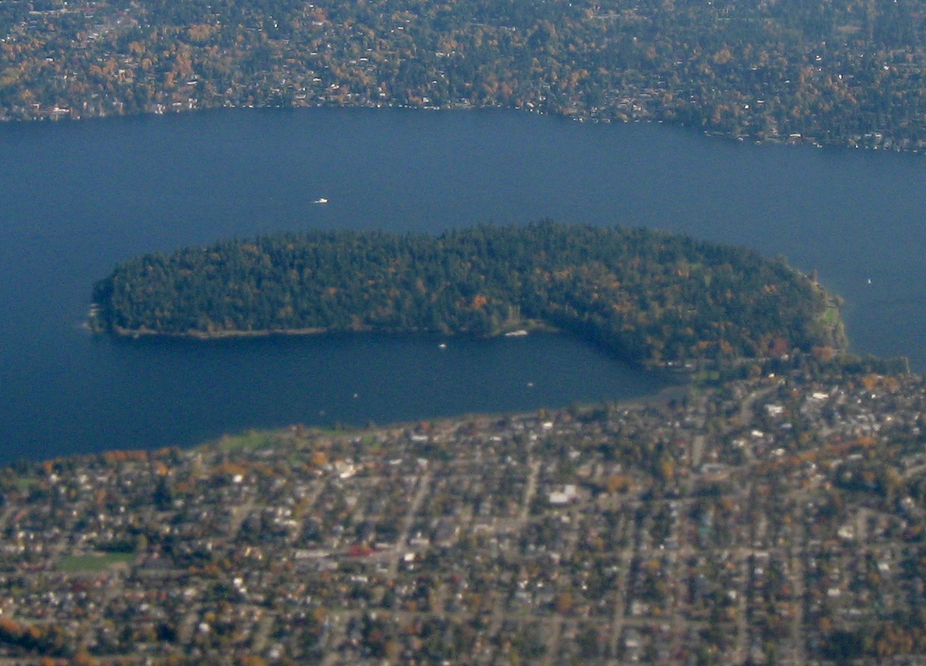
For this initial foray, in Seattle, it was immense fun to wander the areas north of Green Lake and discover the history of Licton Springs. As you see from the map below, the historic routes show a stream flowing southwards into Green Lake. The reach of the waterway starts around Licton Springs Park, where it is sees daylight for a stretch, along with some other intermittent segments where it pops up in surprising ways, throughout the neighborhood.
The story of Licton Springs focuses on the significance to Native Duwamish peoples, who celebrated the place and it’s spiritual, reddish, iron-oxide infused waters, and to early settlers, who lived and recreated, bathed in thermal pools, and bottled and drank of the healing mineral waters.
Like many places, the history of how the place evolved and how it was maintained is of interest, but the journey of the now and the experience of a day of exploring the edges, the muddy margins, and the sloppy seeps (lost shoes included) connect the history of place to the experience of today.
Beyond the park, there are a number of other discoveries that paint a story of people and place woved together through the flow of water. Discovery of the story of Pilling’s Pond, a small section carved out of the flow of Licton Springs to provide a sanctuary where Charles Pilling became a world expert duck breeding in the middle of Seattle.
The discoveries also include a unique segment of stream fronting Ashworth Avenue, a single residential block with driveways and fences literally bridging over the final daylit segment of of Licton Springs, showing how each owner shaped, or left feral, their little piece of the wild.
The connection as well with the virtual, with the final connection is made to Green Lake. Now only connected via overflow, the tracery of Licton Springs, imagined perhaps in some abstracted water play forms, swales, and cascades, may still be allow the creek to be evident, if only in our imagination.
The link below expands on this summary, so check it out, go out and explore, and come back with some water stories of your own.
Week three of the Waterlines class featured Seattle writer and geologist David B. Williams. Perhaps best known as the author of the recent ‘Too High and Too Steep’, a chronicle the large-scale manipulations (topographic and hydrologic, to name a few), Williams shared a more focused talk on his upcoming book Waterway: The Story of Seattle’s Locks and Ship Canal, which coincides with the Centennial of the Hiram M. Chittenden Locks this year. Following the course theme, and touching on some previous topics, the story encompasses the trials and tribulations to get the locks built, and the large-scale impacts that such endeavors have on the ecological and hydrological systems of Seattle.
David is an engaging storyteller, so he laid out the evolution of this significant part of Seattle’s history, touching on the geology (with the north south orientation how important the waterways were to getting around, especially, east-west movement), and the use for years by native people, who used the portage between Lake Washington to Lake Union, and then a quick connection to gain access to the ocean, and vice-versa, for the past 10,000 to 12,000 years, with stories of Kitsap Suquamish coming to Lake Washington because it was one of the largest freshwater lakes in the region. The idea of a ship canal of some sort is as old as Seattle itself, first pitched by Thomas Mercer in 1854 and finally coming to fruition as a way to move coal, timber, and people, after many attempts 63 years later. In fact there were multiple routes proposed and attempted with big Seattle names like the aforementioned Mercer, along with Burke, Denny, and Gilman, cutting through Smith Cove, routes across what is currently downtown, and one of the most absurd in Seattle’s history – the Semple Canal. This map shows a number of these routes, and also the one natural, yet not very viable connection vai the Black River, which was mentioned in the previous post on Seattle archaeology as outlet from Lake Washington and would eventually fall victim to the draining of Lake Washington.
By Dennis Bratland – Own work, CC BY-SA 4.0,
As mentioned, Semple’s Canal was perhaps the craziest scheme, wanting to slice through one of Seattle’s seven hills, Beacon Hill, which stands almost 350 feet tall. Williams documents it on his blog in this post, with a couple of graphics showing the route and section cut (noting a maximum cut of a mere 284′-6″), highlighting the absurd notion of cutting a canal through a hill, although a good portion of the material removed from the canal before it was shut down was used to fill the Duwamish estuary into what is now industrial lands, and frankly, based on some of the other history, it would not have surprised me if this would have happened.
The eventual route of the Canal was landed on eventually towards the end of the 19th century, connecting to the Puget Sound through the existing Shilshole Bay and the eventual location of the locks, connecting through Salmon Bay, which was a fluctuating saltwater tide zone, connecting through the Fremont Cut to Lake Union, and the Montlake Cut connecting Portage Bay on the west with Union Bay and larger Lake Washington on the east.
The conditions prior to implementation show Salmon Bay connected to salt water, and involved slicing through Ross Creek and wetland zones between Salmon Bay and Lake Union, where a creek was feeding the Bay. To the east the portage had become a narrow log flume at the narrowest point connecting Union Bay and Portage bay, completing the connection from lake to sea.
As mentioned, the eastern Montlake Cut was used as a log flume with a narrow channel (developed by Denny and others) connecting through Portage Bay, and a similar effort was made to connect through Ross Creek via what is now the the Fremont Cut. A photo showing the area looking from Union Bay towards the west from Paul Dorpat’s blog showing the isthmus with Portage Bay in the distance prior to ship canal. This area was sliced through with a log flume (seen on the 1894 map above) in the 1880s and at times through the early 1900s to move timber from inner areas to Seattle and beyond, setting the stage for the eventual connection.
A second image showing the narrow connection of the log sluice from 1886 that is seen on the 1894 map, one of the thin connections which eventually were expanded for free flow of goods and people across Seattle. A dam at the upper end held Lake Washington above the level of Lake Union, and logs were dropped into this chute to float on the next leg of the journey.
While the connections seem logical, the elevations of each water body were different, with the level of Lake Union around +20, the level of Lake Washington at +29, and Salmon Bay elevation lower as it entered the Puget Sound, often not having standing water at times. The process of building the locks set all of these elevations at the same as Lake Union, which raised Salmon Bay and made it a continuous fresh water bay, which is why it works as a place to over-winter fishing fleets as it is today (see Deadliest Catch) to keep boats out of salt water. It also lowered Lake Washington, which as mentioned disconnected the lake from it’s natural outfall at the Black River to the south, replumbing the south area of Seattle while creating a whole lot of new lakefront land. The completion of construction of the locks and the eventually breaching of the Montlake coffer dam (below) and the other coffer dams at the Fremont Cut, (after having to shore them up a few times), filled Salmon Bay with fresh water, and caused Lake Washington to drain down the 9 feet slowly over a few months
The locks, which opened to fanfare and massive 4th of July celebration in 1917, are fun to visit today to watch ships come in, go to the fish ladder, and see the activities. According to Williams, these are the only government locks in the US that are crossable to the public (didn’t know that) and the main traffic, although peppered with an occasional working vessel to Portage bay, consists mostly of pleasure craft. Also, while they did originally build a fish ladder, it didn’t work well (and was improved years later, which make a fun viewing opportunity). Williams mentioned that fish tended to just get into the locks and ride up to travel upstream. It’s an interesting resilience story that fish that were cut off from the Cedar River where they spawned when the Black River was disconnected, and instead of heading up the Duwamish/Black/Cedar to the south, would still be able to figure out how to get upstream via alternative routes via Shilshole miles north from their original spawning route. Talk about a well established navigation system.
The impacts for Seattle, much like the other massive changes, ended up having huge economic implications in positive ways, with the ability to tap into industrial lands for coal, timber, and shipbuilding, and some minor military use, along with what are mostly now marinas for pleasure craft today. The fact that maritime industries are only second to aerospace in the Seattle economy is surprising, which owes much to the ship canal. Seems a common story for Seattle, make massive change and reap the benefits (to some), even if it cuts off a river that happens to be the home place for local Native people. To comprehend the 60+ year journey from idea to fruition, and the hundred years of operation since, another story of changing land and waters influencing our urban lives every day. Excited to see some of the events and read David’s upcoming book for more. On that note…
Addenda: Making the Cut
A great resource on the upcoming centennial festivities is the website Making the Cut: The Locks, The Lakes and a Century of Change, which provides info on events, much of the history mentioned above, and a good section on historic maps which shows a good cross section of hidden hydrology in relationship to the hydrological manipulations to connect the lakes to the ocean. A series of before and after maps documents the changes in the locks, Lake Union and Lake Washington, and other areas. The series below highlights the evolution from the tidal marsh of Salmon Bay prior to the locks being installed in 1916 to the freshwater waterway today.
Salmon Bay – TodaySalmon Bay – prior to 1916 | Blue = Water | Green = freshwater wetlands | Pink: saltwater wetlands | Brown: intertidal areas (or tidal flats)
Last week was Part 2 of the Waterlines class, featuring archaeologist Dennis Lewarch, Suquamish Tribal Historic Preservation Officer, with a concept of ‘Before the Cut’. This was an exploration “using archaeological, ethnographic and historical data [to discuss] the effects of shoreline transformations on indigenous populations.” Similar to the first class, the depth and breadth of the cultural history, and his more expansive title ‘Archaeology and Ethnographic Background of Seattle and Prior Massive Anthropogenic Modifications” hints at the depth of this topic.
Lots of details here, but the idea that in the past 14,000 years of occupation by native peoples, after migration from the north via the Bering Land Bridge and along the outside edge of the ice. There are various theories, but that the retreating glaciers opened up a path between that allowed access, and continuous occupation is found throughout the Northwest in archaeological sites 12-13000 years of age. Once here, the land has changed via sea level rise, mudflows, earthquakes, tsunamis, subsidence, alluvial processes, and more. The story is thus the land shaping people, and the people shaping land. The defining characteristics of the different tribal groups are called adaptions, and place origins of geography, such as the Saltwater adaptation, particularly the Suquamish who lived near the sea, versus the Riverine adaptation, the Duwamish people who lived near the river. Other adaptations are tied to lakes and inland/upland areas, all of which collectively shape the speech, family community, and cultures. For Lewarch’s presentation, the focus discussed a larger history of regional indigenous occupation of the Seattle area, with focus on some of the areas near Seattle that had significance.
Black River Origins
One of the main points of origin for Duwamish people, based on the above adaption, is the Black River, where four original villages were located. An excerpt from the 1909 USGS Topographic map of the area shows the former drainage, where the Cedar River flowed in from the east, and the Black River drained the south part of Lake Washington, near Renton. This confluence also was fed from the south by the former route of the White River, as all of it flowed into the Duwamish and out to the Sound. The names of the settlements of the ‘People of the Lake Fork’ and the inhabitants near the Little Cedar River, and their evolution in living off the land and the river ecosystems for many years.
The demise of this home place began with channelization of the Cedar River into Lake Washington, and ended he lowering of the lake when the Hiram M. Chittenden Locks were built in 1916. The elevation of Lake Washington was lowered nine feet, to the same as Lake Union, which severed its outflow to the Black River, captured in the photo below shows the river after the lowering of the lake, where it slowly died and has (mostly) been subsequently buried. For more on the Black River history, a short blurb on this from David Williams here.
The map from the Wikipedia page on the Black River also shows the before and after and the erasure of the original location of Duwamish settlements through reconfiguration of the hydrology of the region, another in a long line of massive manipulations in the region. The Duwamish People were living in the area, and continued to do so, even as the Black River was dying. They were relocated to reservations, and as Lewarch mentioned, they were sent to coastal areas near the ocean, and being a river tribe, kept returning to the river to fish for many years after, where they lived on a property owned by Erasmus Smithers, until it was burned in 1896. There’s inevitably a long history of settlement and resettlement and disenfranchisement throughout recent history I’m glossing over, but the idea of a river tribe not having a river seems par for the course of how tribes were treated. Secondary to this, the subtle differences between different tribes were not recognized, with many Suquamish or other tribes in the region being lumped into the Duwamish by colonists.
Duwamish River
The Duwamish River obviously had a significant place in the history of this river tribe, and the estuary connected the river people with those of the sea and the density of place names in that zone . A number of archaeological sites amidst the oxbows of this area. The 1899 US Coast Survey shows the bay and larger estuary, with the area of downtown Seattle starting to build out, but prior to the majority of the land filling to come.
A map of these old configuration juxtaposed with the channel that exists today shows the level of land filling and manipulation done to this area to carve out industrial lands. From the fantastic Duwamish Revealed site: “About 100 years ago, the Duwamish was straightened and dredged, reducing 14 miles of winding river to 5 miles of industrial “waterway.” Nearly all of the native habitat – mudflats, marshes, and swamps surrounded by old growth Cedar, Douglas Fir, and Hemlock trees – was replaced by agriculture, then industry. The Duwamish is home to three Native tribes: The Duwamish, the Muckleshoot, and the Suquamish, and has immense cultural importance to them. The word “Duwamish” is an Anglicized version of Dkhw’Duw’Absh, meaning “people of the inside” in Lushootseed, the language of the Coast Salish people.”
Ballast Island
While native peoples were instrumental in building the city and working in it’s saw mills, fisheries and other industry, rapidly changing Seattle began to try to eliminate the native residents of the city, passing laws in 1863 to make it illegal for Indians to live in Seattle unless they worked for whites, villages and settlements were burned. Native peoples moved north as development occurred, and tended to stay near the water, occupying places within the network of piers and wharves. One such place was Ballast Island, formed from ships dumping rocks after their voyages, which slowly accumulated into made land. A photo from the area shows the colonization of this space by Native peoples, who camped out around the wharfs fringes, being ogled by early Seattlites. In 1891 they were forcibly removed, one in a string of forced removals that shaped the early history of the area.
West Point & Shilshole
Moving away from downtown, the occupation and history of West Point, the point that was formerly military outpost and now Discovery Park, along with being the massive sewage-treatment plant. This area was a tidal marsh that was occupied and used, with the formation of sediment along with earthquakes shaping. When the treatment plant was being expanded, a significant archaeological effort was undertaken, beautifully documented in this online resource from the Burke Museum. Shilshole also has a significance to Native Seattle, with the native word meaning ‘threading the needle’ to get into the small mouth that led into Salmon Bay, which was littered with shell middens and other features showing occupation, similar to other areas on the coast. Prior to the creation of the locks, this area . One long-time resident was Salmon Bay Charlie. A great resource for this and other Seattle history is the blog by Paul Dorpat featuring ‘Seattle: Now & Then‘, where you can investigate the area in some more detail. From the post: “Salmon Bay Charlie and his wife lived in their cedar plank home on the south shore of Magnolia’s Salmon Bay. For half a century Charlie, also known as Siwash Charlie, sold salmon, clams and berries to the first settlers and later to the soldiers at Fort Lawton. Today’s historical view shows Charlie’s house at the turn of the century, taken by the photography firm, Webster and Stevens.”
A bit to the east, the connection between the eastern edge of Lake Union and Lake Washington is a good discussion of place names, including the connections between Lushootseed, or Coast Salish names and colonist names. This brought up a discussion of the area below,
I rotated the Waterlines map to match the same orientation, and the references to the area marked B, which was a village site named sɬuwiɬ, “Little Canoe Channel” that marked the mouth of Ravenna Creek, where Lewarch mentions there were stories of salmon runs up Ravenna. There’s also Lake Union, marked as #21, which is called x̌ax̌əču meaning, “Small Lake” and Foster Island, in an area named staɬaɬ or “Baby Fathom” showing that even with a translation there is still a story missing. Perhaps a shallow zones at the mouth of the creek. The cut, marked as #18 which is named sxʷac̓adwiɬ translated as “Carry a Canoe” meaning it probably wasn’t passable as a waterway until later when the Denny’s opened it up as a log-sluice to move timber between the two points.
According to Lewarch, the notes from Waterman were sort of a mess, so the editors compiled it into something readable, including an amazing figure in Seattle history, Vi Hilbert, a Puget Salish and “a conservationist of the Lushootseed language and Culture”. While Waterman interviewed a small group of around 25 native people for his work, it generated over one thousand place names. And as Lewarch mentioned, all of those interviewed said if they had talked to the Elders, they would have ended up with 1000s more, a sad testament to a cultural history lost forever. Another resource for this is Coll Thrush’s book ‘Native Seattle‘ offers a great section with maps of those place names developed along with Anthropologist Nile Thompson, a snapshot of one below with the accompanying Lushootseed language and origins. Many of these as I mentioned ended up on the Waterlines map, with more abbreviated descriptions. The one below shows the NW corner with Green Lake in the center, and West Point, Lake Union, and Salmon Bay, along with areas along the coast marked.
CONCLUSION:
Lots of threads to follow and stories to connect. In general, the talk focused on the Indigenous cultures and their resilience, both pre-European settlement and after colonization, displacement, and more. He ended up with a quote from Chief Seattle, and discussion both of the potential misinterpretation of his words by the translator, and whether it was an environmental, or social statement, but the multiple meanings that resonated strongly in Seattle history. He quoted a passage:
“And when the last Red Man shall have perished, and the memory of my tribe shall have become a myth among the White Men, these shores will swarm with the invisible dead of my tribe, and when your children’s children think themselves alone in the field, the store, the shop, upon the highway, or in the silence of the pathless woods, they will not be alone. In all the earth there is no place dedicated to solitude. At night when the streets of your cities and villages are silent and you think them deserted, they will throng with the returning hosts that once filled them and still love this beautiful land. The White Man will never be alone.”
Chief Seattle’s niece at her Shilshole home, 1901 – via http://www.duwamishtribe.org/culture.html
It could be both a warning or a statement that shows that resilience of Native people wasn’t just in survival, but left a permanent mark on the landscape and people. The culture and place of what Seattle is and the way we should live is etched in history and resonates in the places dotting the map of Seattle, including waters visible and hidden.
ADDENDA:
A preliminary presentation featured Amir Sheikh, one of the primary collaborators on the Waterlines Project, and he discussed much of the history and process of the overall project and methodology along with framing the concept of place names using Lushootseed language, as featured on the Waterline maps (see my post on language here). One video he showed was “Djidjila’letch to Pioneer Square: From Native village to Seattle metropolis“, a video which takes the viewer “…from Native village to metropolis, the Pioneer Square neighborhood of Seattle has undergone dramatic transformations. This animation provides a bird’s eye glimpse at some of the social, economic, and landscape histories of the neighborhood through time.”
A great kickoff lecture to the Waterlines class at the Burke Museum featured noted regional geologist and retired UW Professor Dr. Stan Chernicoff and his exploration of The Origins of Seattle’s Landscape. Having read a bit about the local geology over the years, and having experienced some specifics (particularly the glacial till in Seattle) in my work, I had a rudimentary understanding of the general picture in our region. Thanks to this lecture, and the philosophy that ‘dynamism is key and change is inevitable’ espoused by Chernicoff, I know a lot more and think about the region in new ways. From his lecture, I found some interesting links between the larger and longer scales of geologic time and it’s relevance to the Hidden Hydrology project.
His lecture loosely focused around the concept of changing Waterlines around the region, and organized his talk to be roughly chronological and covered a lot of ground – from 1.1 billion years into the past to 250 million years into the future. Much of the beginning conversation was looking back at the time when Seattle was not coastal but inland as part of the Rodinian Supercontinent (one of the pre-Pangean configurations) and the coastal accretion of lands from the final supercontinent (where to coast was originally at the MT/ID border), and the lands that were added over the past 150 million years (Okanogan Mountains, Cascade Mountains, San Juan Mountains and most recently the Olympia Mountains) through lands being drawn in through subduction. This means that Washington and Oregon are mere infants in the larger timescale, as Chernicoff mentions, compared with the larger geological history. The key diagram he showed here is the overlapping sections of the subduction zone in the Juan de Fuca plate and the location of between the Olympics and the Cascade Mountains, with the layers levels and timelines of geological traces over the past 50 million years..
The bit of trivia that Seattle is sitting atop the Olympic Mountains – as you can see by drawing a line through to the Crescent Basalts below us. The evolution from the last 40 million years in shaping the zone, through Volcanic mudflows (yeah, there was a volcano called Mt. Seattle somewhere near Issaquah) that left lahars 40 million years ago. This was followed by periods of inundation, and when the land was warm and swampy, which left the deposits of coal near Renton (an interesting Puget Sounds coal history where we ended up shipping to San Francisco). The marine heritage is also found in the prevalent Blakeley formation, which evolved from a shallow marine estuary from submarine landscape deposits 30 million years ago – and today one can still find fossil shells around many places in the Puget Sound.
There are some interesting facts that illuminate this history and dynamic story of change. First, while the larger geology set the stage and influences the form, the current lakes, and rivers were a product of the latest glacial period, which Cordilleran Ice Sheet covered the area and the Puget Lobe formed the shape of the current region. The glacier was around 3000 feet thick, which pushed the sound down almost 1000 feet, and created the depression that allowed water to flow in and formed the modern position of waters.
The rule of thumb is the thickness of depression will be 1/3 the thickness of the glacier. An interesting section (see right) showing how this cap of ice carved out Puget Sound nestled between the Olympic and Cascade Ranges – with linear scoured channels forming Hood Canal, Puget Sound, Lake Washington, Lake Sammamish, and created the terrains which Seattle occupied. These were all relatively north-south oriented which coincides with the intrusion and recession of the Puget Lobe. It is amazing to think of the larger glaciers in the Midwest, such as Minnesota, which were 3 miles thick and the impacts on that landscape, which for my knowledge, creates the rarity of the north-flowing Red River through where I went to college in Fargo, but also created the over 10,000 lakes that dot the region.
Second, is that because of the glaciation and recession, most of the hills in Seattle are glacial drumlins, (with the exception of West Seattle and Magnolia which are drift uplands). These hills were deposited upon glacial retreat, which gives them a distinctive steep north side and smoother south side, with alignment north-south as well as the long side corresponds to the direction of ice flow.
You see this in the larger hills in Seattle, as well as the creation of the individual creeks that are woven throughout the north section of the city. The topography carved these smaller drumlin shapes with drainages forming in the spaces at edges adjacent to lakes or between two hills. This formed unique geologic features like like Seward Park in the south section of Lake Washington.
A shapshot of the 1894 USGS Topo map shows the formation on Queen Anne (left) and Capitol Hill (right) with the steeper north edges, along with what is still showing the remnants of Denny Hill south before it and other topographic features were removed from the downtown area.
Third, the two smaller lakes in North Seattle, Bitter Lake and Haller Lake, are true kettle lakes, formed with glacial retreat. A hybrid of this is Green Lake, which also formed in the glacial retreat along with Lake Union and Lake Washington. Fourth, the glacial movement left a trail of glacial erratics all over the area, and I learned about one of the largest, the Wedgwood Rock, which originally was from miles north and now sits in NE Seattle. Definitely worth a field trip in the near future.
Fifth, the glacial deposition led to a preponderance of landslides, both with steep slopes, along with the layers of permeable Esperance Sand sitting atop a layer of Lawton Clay, which causes water to flow under the sand and create a slip zone (shown on right side of diagram below).
This is exacerbated by the copious winter rainfalls, which exacerbates the issue via critical liquifaction zones, which means“…a phenomenon whereby a saturated or partially saturated soil substantially loses strength and stiffness in response to an applied stress, usually earthquake shaking or other sudden change in stress condition, causing it to behave like a liquid.” Thus the landslides and earthquakes have shaped the hydrology over time, as valley configurations shift with deposition from streams but also are influenced by these disturbance regimes.
The Magnolia Neighborhood is one of those areas where it has overlapped with the danger of building on steep/unstable slopes, as shown here in a wikipedia image of a slide in 1954 on Perkins Lane, a relatively frequent occurrence in Seattle in particular areas over the years. Chernicoff’s hint: Don’t by a house there.
The final part of Chernicoff’s talk focused on the ‘Rise and Fall of Seattle’, with a theme that in our dynamic and ever-changing landscape, “we can’t get accustomed to where water is”. He mentions four factors that will influence the geology of Seattle, including Local Geology, Regional Tectonic Factors, Regional Isostatic Factors (i.e. glacial rebound), and Global Eustatic factors (i.e. sea level rise). This was interesting, as the local conditions were all creating conditions that led to raising lands and lower levels of water. For instance, the two local geological factors were river sedimentation and landslides, both of which add land particularly at the deltas of larger rivers, such as the Skagit and Nisqually Rivers. As Chernicoff put it, through those two factors, the entire Puget Sound is trying to fill itself in. The regional factors of tectonic activity are at work, with quakes occurring regularly, which can instantly change the shape of our landscape through an earthquake. A slower mechanism continues to shift land with raising land due to glacial rebound, bouncing slowly back from being compressed by glaciers thousands of years back.
Inevitably, for all the minor modifications of local and regional factors, the larger impact is, wait for it… yep, global change, in particular the shifts associated with climate change. The melting of remnant ice sheets in Greenland and Antarctica, warming causing the thermal expansion of water combined to create higher levels, and lead to massive impacts on the waterlines of Seattle and everywhere else. He showed as an example a slide of the map Islands of Seattle, a great project by Jeffrey Lin (inspired by the original Burrito Justice San Francisco Archipelago map.) which hypothesized on melting of all global ice, including the Antarctic, which would result in a 240′ rise in sea level, creating a very dramatic new waterline and hydrology for the City.
For Chernicoff, it wasn’t a question of whether this would this happen or not. His geologists time lens is long and he knows there will be large-scale global shifts. The question is yes, however, does the time scale of this inundation take 30 years, 500 years, 10000? It’s an interesting juxtaposition of of deep, long geological time coupled with the dangerous (but possibly earth saving) agency of humans in creating changes in rapidly shorter and shorter time scales, via anthropocentric factors. While we rightly fret over our fate and try to come up with solutions, the idea of dynamism and constant change is a good perspective. In the end, geological time and processes will, it seems, always win, if we’re around in another 250 million years we can experience a new shift to a larger subcontinent, as the Pacific is getting smaller and the Atlantic is getting bigger, so our coastal woes will change when we’re in the middle again. Full circle.
This has some implications, obviously for connecting history to present and future, as we are constantly chasing moving targets when we deal with landscape and water. How will these changes impact our understanding of historical conditions with current ones? At the short time scale we are considering, does it matter? Will rapid global and local changes impact our opportunities and ideas in which to engage with planning and design interventions? Something I’ve not ruminated on long enough to have ideas, but more to come. And more on Waterlines next week.
ADDENDA
As a follow up, a remembered this link from the Burke on Seattle’s Ghost Shorelines links there’s an interesting Waterlines video showing this evolution of the most recent 20,000 years of the sound – since the ice age.
A short rumination from Akiko Busch in the NY Times asks us to Learn a River’s Name Before It’s Gone resonated with me around the idea of language as the cultural thread that weaves. Describing a road trip, where she wrote down the list of over 100 rivers crossed, concluding that “If we couldn’t hear the sound of the water itself, the syllables of the names became a new way for me to chart this country.” The simple idea of knowing the name of something (or someone, for that matter) and although we go a bit crazy with naming storms, Busch posits that:
“it would likely be of greater benefit if we could find a similar pleasure in learning a few of the names that identify those features of the natural world we live with all the time. Which is to say, instead of making up new names, we might consider learning the names that already exist.”
Data and science are critical elements in understanding on many levels, but words and names provide a level of connection. Busch continues: “Giving something a name is the first step in taking care of it. Place names help us to attach landscape to history and region. And when it comes to the question of attachment, we are not just speaking of how names are attached to places, but how humans become attached to places.” Stories of places abound, and continued attacks on environmental regulations aims to further degrade our protections, so “perhaps we could make the effort to learn as many of the names of those places — and the trees, the rivers, the ranges, all the species that live there — as possible, before it’s too late.”
Robert Macfarlane, quoted in Busch’s essay above, says that “Once a landscape goes undescribed and therefore unregarded, it becomes more vulnerable to unwise use or improper action.” To me he embodies the idea of naming and knowing, and I was fascinated by his take on the vibrancy of language, and the stories of how this language is being lost, and the need to retain it – from this Guardian article ‘The word-hoard: Robert Macfarlane on rewilding our language of landscape‘. I wrote about this here in Landscape+Urbanism, and have been currently reading his book Landmarks, which breaks down place language in short essays interspersed with lists focusing on language specific landscape features. The resources The publication of his book led to him receiving a deluge of words from readers from around the globe, Recently on Twitter, Macfarlane posts daily words and continues to collect new ones and has amassed a following of those interested in the word hoard.
This idea connects with other writers of lexicography, such as the fabulous book Home Ground: A Guide to the American Landscape, edited by Barry Lopez and Debra Gwartney, which provides “descriptive language for the American landscape by combining geography, literature, and folklore” and those gems that have been formative for many landscape architects, such as Anne Whiston Spirn’s poetic Language of Landscape. New forms are emerging as well, such as the Lexicon for an Anthropocene Yet Seen, Many
Whose Language, Whose Culture?
The naming, of course, needs to respond to pre-European settlement, as much of the work of ‘finding’ hidden hydrology uses maps that are made by Europeans and often (purposely or ignorantly) erase place names that have be tied to places for years. As we look back into history, we are challenged to find not just the names of places on a map, but to search a richer heritage of Native place names. The work on the Welikia Project explains: “The Lenape people inhabited Mannahatta for thousands of years before the Europeans arrived. They named their island home “Mannahatta,” meaning “Island of Many Hills.” We use the term “Mannahatta” to refer to the island as it was in 1609, and “Manhattan” to refer to the metropolis of today.” When they expanded the concept to the larger NY City metro area, they also adopted the Lenape expression “Welikia,”meaning “my good home,” and infuse place making with Native settlement patterns often in their work.
The Waterlines Project here in Seattle is a great example of connecting Hidden Hydrology to Native language, providing on the map a key with Coast Salish Place Names.
The place names on this map, written in the Lushootseed language of the Coast Salish people, are drawn from elders who worked with ethnographers in the early twentieth century, from the work of linguists and scholars such as the late Vi Hilbert, and from an atlas created by Coll Thrush and Nile Thompson for the book Native Seattle. Place names are stories: proof of presence, archives of meaning, evidence of ancestry, and a reference for treaties and other legal connections to territory. They provide context to the ongoing presence and strong connections to the city for Native people as co-managers of our shared resources. Refer to “An Atlas of Indigenous Seattle” for further information on the Native place names found on this map.”
I’m inspired to learn the names (those of the present, past and distant past) of the local places across history and dig into some of these local resources as I continue to compile my working base of Seattle and Portland Hidden Hydrology. I found a post by local writer David B. Williams on his GeologyWriter blog – which was helpful in summarizing Seattle’s Stream Names, for the more recently naming, and soon to come is some documentation of my recent muddy exploration of Licton Springs, which is named for Liq’tid (LEEK-teed) or Licton (Item #9 above), the Lushootseed word ‘Red Paint’ for the reddish mud of the springs.
Excited to see this announcement of a series classes focused around the Waterlines Project (see my post about it here as well). The four week ‘Waterlines Class Series‘ meets Wednesdays at the Burke Museum and costs $120 ($100 for Burke members), and aims to cover lots of territory on Seattle’s interesting landscape history. From the site:
Wednesday, April 19, 2017 The Origins of Seattle’s Landscape Dr. Stan Chernicoff Discover the dynamic geological forces that shaped and continue to shape the lands of the Salish Sea. During his 30-year tenure at the University of Washington, geologist Dr. Stan Chernicoff established a unique rapport with his students and a mastery of subject matter. In 2000, he received the University of Washington Distinguished Teacher Award for lively curiosity, commitment to research and passion for teaching.
Wednesday, April 26, 2017
Before the Cut
Dennis Lewarch, Suquamish Tribal Historic Preservation Officer Using archaeological, ethnographic and historical data, Dennis Lewarch disccuses the effects of shoreline transformations on indigenous populations. A professional archaeologist, Lewarch has worked in western Washington for over 30 years and brings useful insights that intertwine environmental change, archaeological data and tribal land use in the region.
Wednesday, May 3, 2017 Waterway: The Story of Seattle’s Locks and Ship Canal David B. Williams Find out what drove Seattle’s civic leaders to pursue the dream of a Lake Washington Ship Canal for more than 60 years and what role that canal has played in the region’s development over the past century. The author of Too High and Too Steep: Reshaping Seattle’s Topography, The Seattle Street-Smart Naturalist and Seattle Walks: Discovering History and Nature in the City, David B. Williams also organizes the Burke’s annual Environmental Writer’s Workshop. His upcoming book, Waterway, will be out June 2017.
Wednesday, May 10, 2017 Reclaiming the Duwamish Eric Wagner and Tom Reese Eric Wagner and Tom Reese, author and photographer of Once and Future River: Reclaiming the Duwamish, discuss the history of Seattle’s relationship with its one and only river. Wagner’s writing has appeared in Scientific American, Smithsonian, Audubon and other publications. Reese is a Pulitzer Prize-nominated photojournalist recognized for his feature work and explanatory reporting during his career at The Seattle Times.
A gem of a publication semi-related to hidden hydrology by very related to cool maps, is one the US Geological Survey Miscellaneous Investigations Series I-1799, published in 1988, entitled the “Atlas of Oblique Maps: A collection of landform portrayals of selected areas of the world“. As noted, the maps are all oblique aerials, and range from 1961 to 1986, so are pre-digital. The ability to represent complex geographic and topography features enlightens many maps of this sort, and the techniques to create this makes for a fascinating read.
Some introductory text from the Preface:
There’s a brief by interesting background for the document and some of the key map-makers, including A.K Lobeck, E.J. Raisz, and P.B. King. Some of the benefits of this type of map are discussed, including more realism and easier comprehension, and ability maintain scale. Disadvantages included displacement of features, and hiding of key elements, and a relative inexactness of elevation and location. I think of many of the maps of cities in the late 1800s that were drawn using similar techniques, which show features in a compelling way, but somehow exist with a tantalizing lack of precision.
The graphic standards used are explained, which allows for some uniformity. (click to enlarge):
The mechanism of the Isometrograph was fascinating, which provides the opportunity to “develop a parallel-perspective framework from a vertically viewed contour map” allowing for three-dimensionality without reproducing hidden lines, something we can easily do today with a number of digital tools, but at the time was pretty incredible.
That said, there’s a ton of interpretation and creativity involved, to take the three-dimensional framework and convert it into a compelling illustration, as noted in the sequence below.
So why should these matter, aside from their value as historical maps. The conclusion sums it up, along with a very prescient commentary on the value and future of mapping in our current age of Google Earth:
“Because oblique maps are instructive and easy to read, they help the scientist communicate with the layman concerning our environment, especially in those areas, such as the sea floor, that are not easily accessible. With increasing population and all its attendant stresses on the planet, the need for this communication will become ever greater. Fortunately, in the near future, with new techniques and with the use of computers, the cartographer will be able to respond to this demand and create oblique maps more quickly and more economically.”
A bunch of the examples below show the range of maps – which I count over 100 total, with a vast range in geography from Alaska, Washington and Oregon, California, and many from around the world. The simplicity and elegance of the black and white showcases volcanic variants in the Pacific Northwest, two of my favorite places, Crater Lake and Mount St. Helens.
Some simple color accents coastal variation, in this case Willapa Bay in Oregon.
And the impact works as well for more urbanized zones, in this case San Francisco Bay.
The ability to use the oblique maps to carve out subsurface geology is interesting as well, in this case showing the Sierra Nevada mountains near Mono Lake.
And the bathymetry also, revealing hidden hydrology of bays and coastal waters.
The maps delve into the diagrammatic, as this one stood out to me. The image hovering above the map shows the location of underway navigation transponders in the Pacific Ocean off the coast of Mexico. The squiggly lines show the path of a ship that was mapping the bottom using sonar over multiple years.
The final section of the document highlights what are called ‘Cognitive Drawings’, which are somewhat more familiar slices of topography and geology that often appear in text-books, such as the evolution of river valley from sharper V-shapes to more subtle U-shaped valley systems.
Another hybrid map shows the relationship to the geologic features, in this case Ore deposits in Utah, with some simple accents, again revealing the underlying geological story from below.
The technical aspects of making these maps is admittedly less of a barrier today, but much of what comes from the digital realm lacks the tactile, illustrative quality shown here. A post in Landscape+Urbanism on the art of Matthew Rangel comes to mind as a similar quality in new work, and the inspiration of graphic quality and communicative value is inspiring. Worth a long perusal. Enjoy!
Map-making is an inherently iterative process. Often finding an appropriate base layer is vital to providing a solid foundation for this process. In this spirit, I’ve been working on the digitization of the basic Public Land Survey System (PLSS), or the Cadastral Map series for both Portland and Seattle from the 1850s as base maps for the hidden hydrology studies of both cities. This data, which is the most uniform and complete snapshot of the landscape of the west, is a great resource for the locations of historic streams and other features. Because the use of the shared cartography of Townships with their corresponding Section grids, the PLSS maps provides a link to very accurately georeference the historic with the modern. Prior to diving into some of this work, I thought it prudent to discuss the Public Lands maps themselves.
There’s plenty of history out there for those in the mood, and my plan isn’t a deep dive, but more of some context. A good starting place is ‘The National Map’ page by the USGS on the subject of the PLSS, and a brief history page from the BLM. Everything else you may want to know about the Cadastral Survey is found at the Bureau of Land Management page of Tools, including the massive 1983 History of the Rectangular Survey System by C.A. White (46mb PDF). The terminology of the PLSS, is somewhat synonymous with the concept of Cadastral Survey, although in reality there is a difference, as one (PLSS) is the thing itself mapping the United States, and the other (Cadastral) a type of survey, defined as “having to do with the boundaries of land parcels.” Cadastral surveys of all types are done all over the world, and the origin comes from the “…Latin base term Cadastre referring to a registry of lands. So actually Cadastral Surveying is surveying having to do with determining and defining land ownership and boundaries” (via Cadastral Survey).
After the Revolutionary War, there was huge amounts of available land, and the need to distribute and sell tracts became necessary for the new survey. While the original colonies were laid out pre-PLSS using more traditional metes and bounds, but due to the immensity of the effort, Thomas Jefferson proposed a system of surveying massive open tracts of land. The Land Ordinance of 1785 set up the system and the subsequent 1787 Northwest Ordinance kick-started the process (although it referred to the areas NW of the colonies, not the actual NW Territories).
The surveying moved across the country over the next hundred years – as The extent of the surveying is captured in the map below, starting in Ohio and Florida on the east and encompassing the majority of the midwest, plains, and west including Alaska (which is still being surveyed today), with the only exception being Texas. Almost 1.5 billion acres were included.
Anyone who has looked at a survey will be familiar with the language of the PLSS. Any legal land description could be generated starting with“…the State, Principal Meridian name, Township and Range designations with directions, and the section number”. There are many versions of this diagram out there, but it breaks down the foundations of the PLSS using the Principal Meridians and Base Lines, and breaking the grid into Townships and the 36 smaller Sections.
The markers are vital to maintaining the integrity of the grid over centuries, and there are approximately 2.6 million section corners across the US. An interesting link to the ‘Corner Identification and Markings’ shows some of the layout specifics and one of the common protection measures employed for the corner monuments, circling the monument in a circle of stone. There is a shared geography continuity between the principal Willamette Meridian, established in 1851, with bisects both Portland and Seattle, and the shared baseline which runs parallel a bit south of the border between the two states.
In the Pacific Northwest, and there’s some reverence for the particular. The Principal Meridian Project is pretty fun, and has some great photos of the Initial Point (the crossing of the Principal Meridian and the Base Line seen above), found in Willamette Stone State Heritage Site in Portland.
“The Willamette Meridian was established June 4th, 1851 and runs from the Canadian border to the northern border of California. The base line runs from the Pacific Ocean to the Idaho border. All property in Washington and Oregon is referenced to this point. The original stake was replaced by a large stone in 1855 and is now part of The Willamette Stone Park in Portland.”
The PLSS is still updated, so if you want a deep dive in this topic, you can reference, the 1973 Manual of Surveying Instructions , which provides the most current info on PLSS surveying. Rather than a mere history lesson, the concept of the PLSS is vital to the understanding the ability to reference historical maps and . This is less important for East Coast but for a large portion of the United States, is the vital tool for hidden hydrology work. Also the extent of coverage that was all completed within a short timeframe (at least in local areas) provides a measure of comparability between areas.
A typical survey map shows the detail of the maps, in this case Township No. 1 N. Range No. 1 East, in the Willamette Meridian, with downtown Portland in the bottom of the map, and showing some of the topographic features, ponds, and streams. IN this case, the original 1852 map was redrawn in the early 1900s, which is pretty common. This info is downloadable via the BLM site.
And the typical surveyor notes, which are a tough read, but shows the information which was later interpreted by the mapmakers, based on the surveyors notations as they followed the specific section lines within the individual townships. The interpretation is a key item that implies the ‘filling in the blanks’ of these maps, as each line was not individually surveyed.
To see this in action, and to explain the correlation between georeferenced history maps and the modern GIS, you see the rectangular areas of the map Sections (this map is a composite of the map above (T01sn01e) and the Township below (T01s01e). This is the area in the Taggart neighborhood, in this case the upper Taggart Basin, showing the Willamette River (light blue), some small water bodies and streams (darker blue), as well as riparian wetlands (green).
The same area is georeferenced with modern GIS info (in this case the 2010 roads, parks, schools), and you can see the Section Lines (orange) that register on maps. The Taggart streams have long been buried, along with the filling of the wetlands along the Willamette for industrial lands. The modern topography is also shown, and you can see the tracings of the landscape channels still evident today.
The ability to tap into other map tools, in this case digital elevation ‘hillshade’ model (of the Lower Taggart Basin) again give some context for new and old, and graphically show some of the landform that exists today. There’s no shortage of analysis once the PLSS info is referenced. Lots more specific info on these maps in Portland and Seattle coming soon.
While amazingly detailed, the maps are, as mentioned, somewhat variable in nature due to the interpretation of survey notes and mapmaking. Thus, the PLSS becomes a great starting point, with good coverage and georeferencing, some they become a framework for overlaying other maps and data. Also, while the surveying standards were the same, as I will point out in a future posts, the quality and legibility of the maps often depended on the mapmakers themselves, and maps of one location could have very different information. This is evident from looking at Seattle versus Portland, and what i feel is a specific quality of maps in the latter versus the former.
Endnote: Having grown up in North Dakota, I was very aware both of the grid, and the ubiquitous grid-shift – as the rhythm of gravel roads cut through the state if perhaps more evident and legible when each ‘back road’ follows a grid. The excerpt below from Fathom shows the amount of contiguous one miles squares.
This making it infinitely possible to chart one’s path multiple ways to get to locations, and also comes with long stretches of arrow-straight road ending with a curve or more often a tee. Many a speeding or slightly inebriated driver was been surprised by this phenomenon. This comes up perusing such Instagram accounts like The Jefferson Grid, and for me more recently someone linked to re-posted from an article in Hyperallergic, featuring work of artist Gerco de Ruijter from 2015, as he masterfully documents this using a series of Google Earth images.
“By superimposing a rectangular grid on the earth surface, a grid built from exact square miles, the spherical deviations have to be fixed. After all, the grid has only two dimensions. The north-south boundaries in the grid are on the lines of longitude, which converge to the north. The roads that follow these boundaries must dogleg every twenty-four miles to counter the diminishing distances: Grid Corrections”
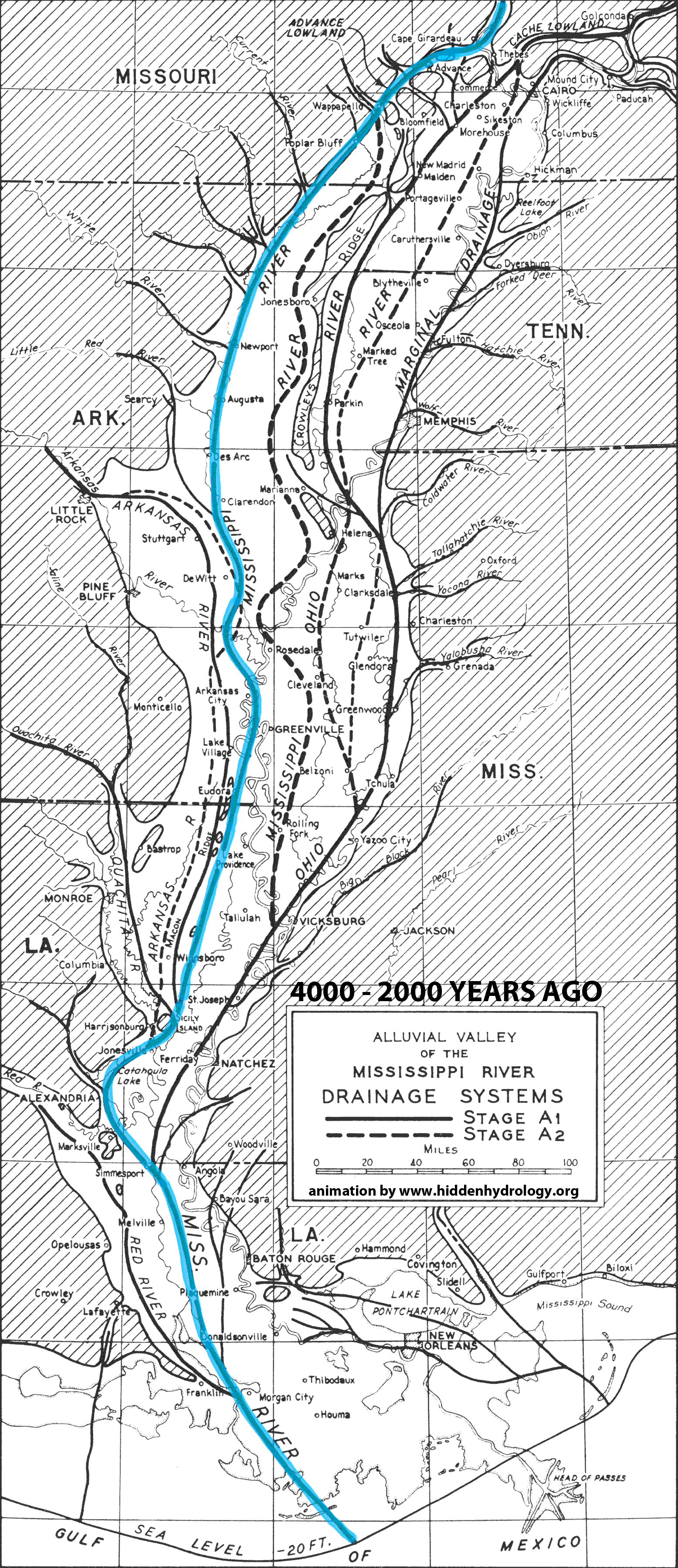
From the recent post, Indeterminate Rivers the Geological Investigation of the Alluvial Valley of the Lower Mississippi River by Harold N. Fisk offers a wealth of information on landscape change. When I first saw the series of maps the idea of showing the shifting path of the river came to mind – and I envision a much more intensive and animated idea could be applied to the color map series (from the original post) to illuminate not just the static traces but the actions of this hidden hydrology over time.
The simple animation below is based on the maps in the report that discuss the formation of the valley and the current configuration of the meanders. For reference, this map isn’t an attempt to make conclusions, but to activate some of the data represented in 2-D format in the report – showing the breadth of change of the main path of the Mississippi over the course of 4000 years of change.


 image via Boeing


